
For a moment, let’s entertain a hypothetical. Let’s say you have an excellent paper on your hands about the impact of smoke on the lungs. Your team is about to submit it for publication: pretty exciting! When you get your paper back from the publisher, it’s mostly good news: they’re willing to publish your paper with the caveat that you add a diagram of the lungs to your paper as a visual aid of the systems impacted. The problem? You have no idea where you could acquire an image that would suit this task that wouldn’t potentially violate copyright.
With this conundrum, one of your coauthors suggests a solution: why not generate one? They have a subscription to Midjourney, the AI software that can generate images from text. Why not give Midjourney a summary of the diagram you need, have it generate it, and then use that for your paper. After checking the journal’s policies on AI (it’s allowed with disclosure), you do just that, glad to have quickly moved past that stumbling block.
Pretty great, right? It sure sounds like it, until you take a look at the images Midjourney generated. Because on closer inspection, there are some problems.
Below is an image I generated in CoPilot for this blog post. I didn’t ask it to do something as complicated as making a diagram of how smoking impacts the lungs; instead I asked for just a diagram of human lungs. Here is what I got, with my notes attached.
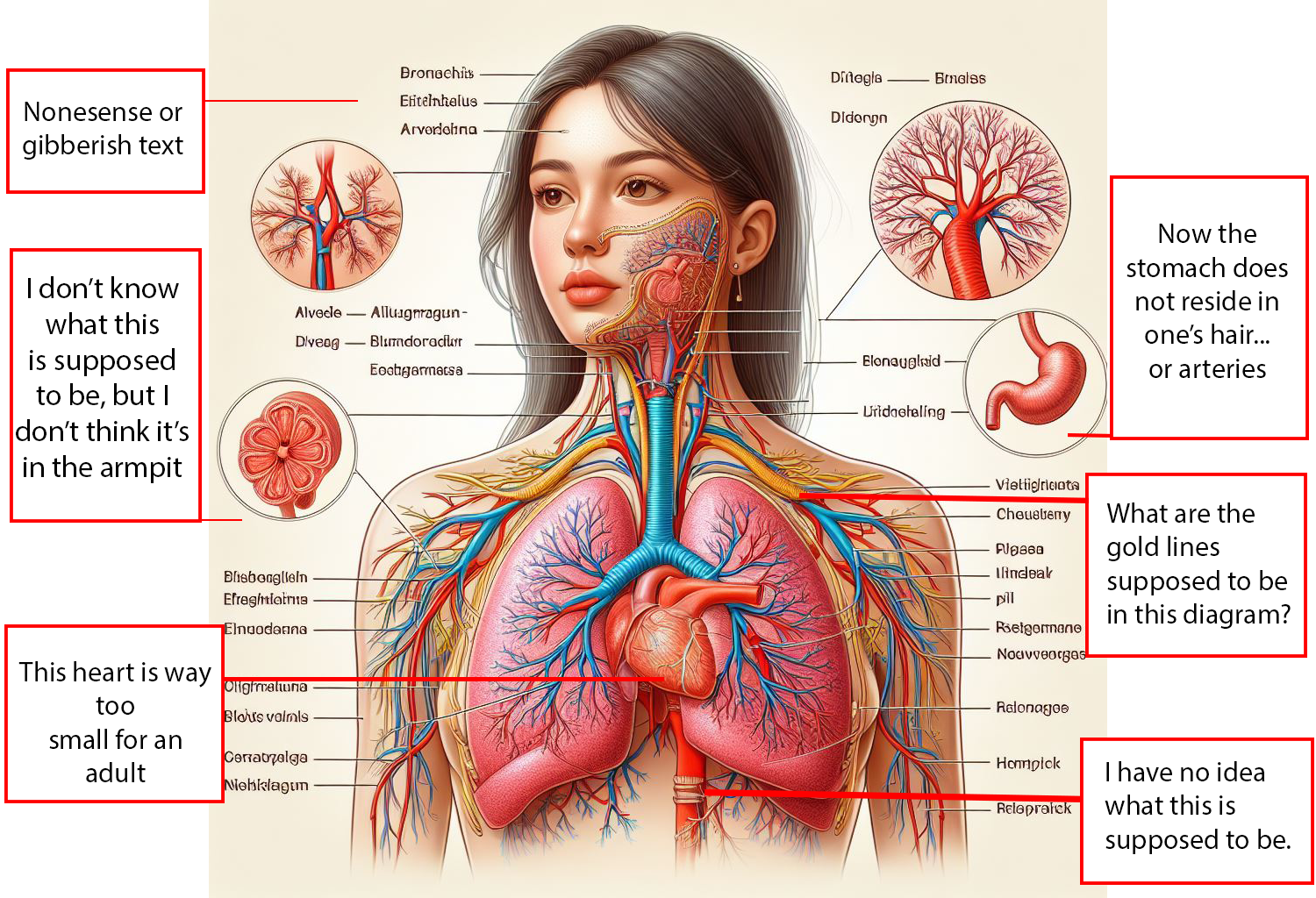
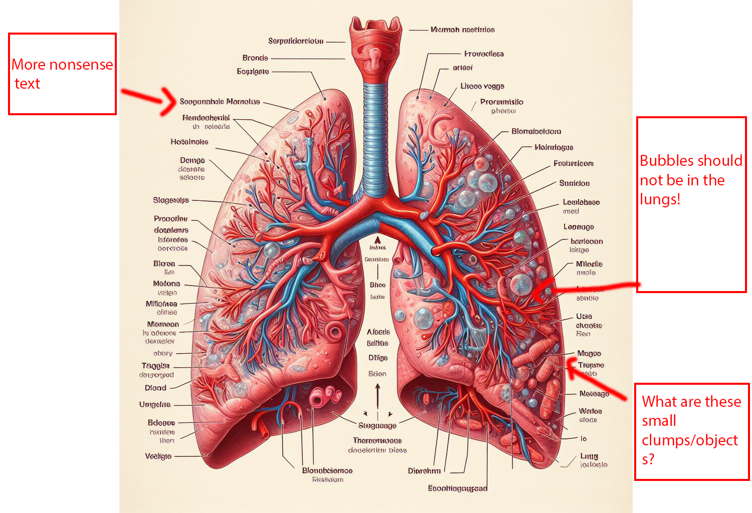
Alright, so this might not be our best image. Thankfully, we have others. Let’s take a look at another image from the same prompt and see if it does a better job.
So what happened here? To explain how this image went terribly wrong, it’s best to start with an explanation of how AI actually works.
When we think of AI, we generally think of movies like The Terminator or The Matrix, where robots can fully think and make decisions, just like a human can. As cool (or terrifying depending on your point of view) as that is, such highly developed forms of artificial intelligence still solely exist in the realm of science fiction. What we call AI now is something known as generative AI. To vastly simplify the process, generative AI works as follows: you take a computer and feed it a large amount of information that resembles what you want it to possibly generate. This is known as “training data.” The AI then attempts to replicate images based on the original training data. (Vox made a video explaining this process much better than I can). So for example, if I feed an AI picture of cats, over time, it identifies aspects of cats across photos: fur, four legs, a tail, a nose,etc. After a period of time, it then generates images based on those qualities. And that’s how we get websites like “These Cats Do Not Exist.”
If you take a look at “These Cats Do Not Exist” you might notice something interesting: the quality of fake cat photos varies widely. Some of the cats it generates look like perfectly normal cats. Others appear slightly off; they might have odd proportions or too many paws. And a whole other contingent appears as what can best be described as eldritch monstrosities.
The reason for the errors in both our above images and our fake cats is due to the fact that the AI doesn’t understand what we are asking it to make. The bot has no concept of lungs as an organ, or cats as a creature; it merely recognizes aspects and characteristics of those concepts. This is why AI art and AI images can look impressive on the surface but fall apart under any scrutiny: the robot can mimic patterns well enough, but the details are much harder to replicate, especially when details vary so much between images. For example, consider these diagrams of human cells I had AI generate for this blog post.
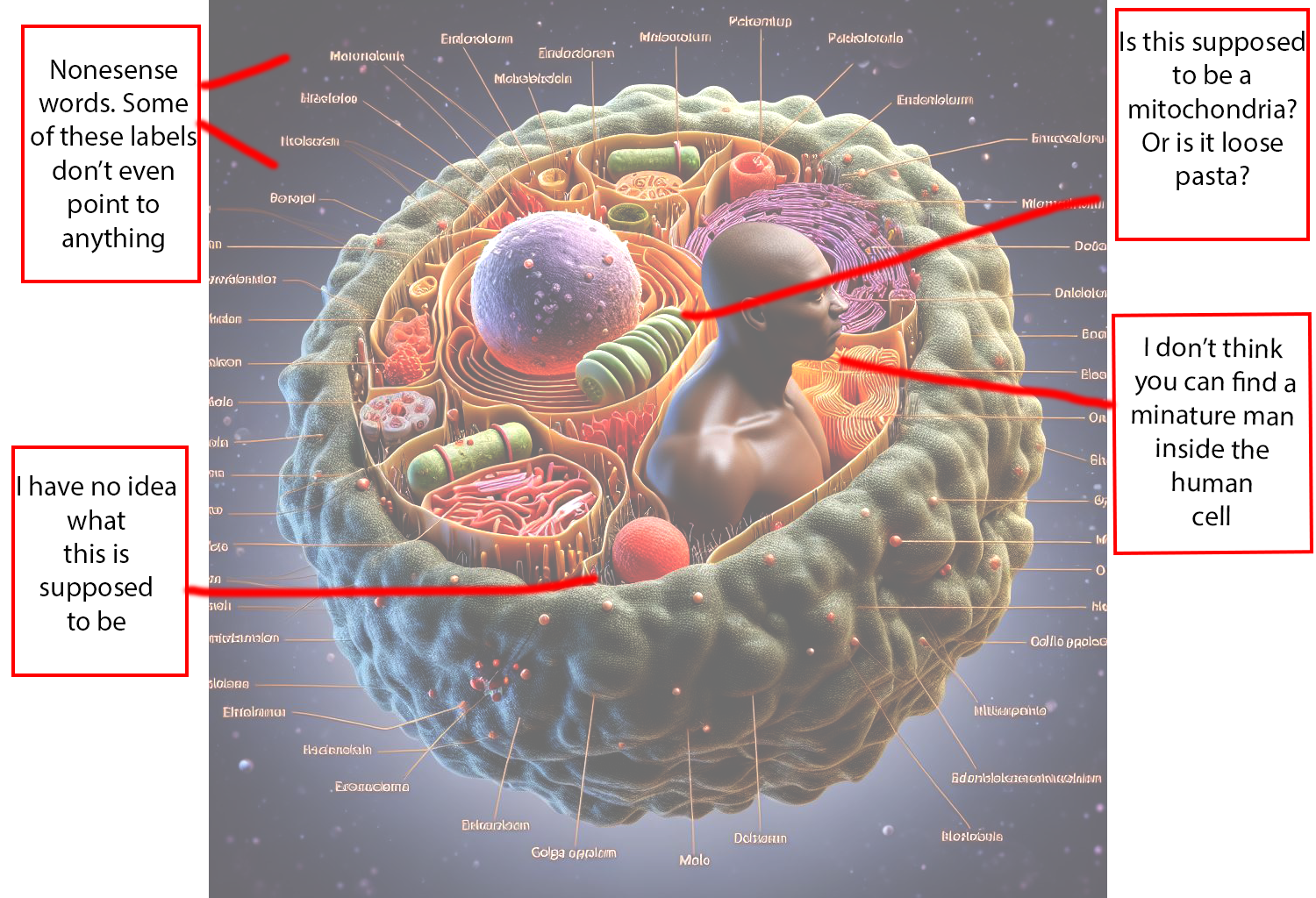
Our AI doesn’t do bad in some regards: it understands the importance of a nucleus, and that a human cell should be round. This is pretty consistent across the images I had it make. But when it comes to showcasing other parts of the cell we run into trouble, given how differently such things are presented in other diagrams. The shape that one artist might decide to use for anaspect of a cell, another artist might draw entirely differently. The AI doesn’t understand the concept of a human cell, it is merely replicating images it’s been fed.
These errors can lead to embarrassing consequences. In March, a paper went viral for all the wrong reasons; the AI images the writers used had many of the flaws listed above, along with a picture of a mouse that was rather absurd. While the writers disclosed the use of AI, the fact these images passed peer review with nonsense text and other flaws, turned into a massive scandal. The paper was later retracted.
Let’s go back to our hypothetical. If you need images for your paper or project, instead of using AI, why not use some of Himmelfarb’s resources? On this Image Resources LibGuide, you will find multiple places to find reputable images, with clear copyright permissions. There are plenty of options from which to work.
As for our AI image generators? If you want to generate photos of cats, go ahead! But leave the scientific charts and images for humans.
Sources:
- Ai Art, explained. YouTube. June 1, 2022. Accessed April 19, 2024. https://www.youtube.com/watch?v=SVcsDDABEkM.
- Wong C. AI-generated images and video are here: how could they shape research? Nature (London). Published online 2024.

