Skip to content

We've been playing around with different pooling strategies recently -- what regions to average over when pooling from the final convolutional layer to the pooled layer (which we sometimes use directly in embedding, or which gets passed into a fully connected layer to produce output features). One idea that we were playing with for classification was to use class activation maps to drive the pooling. Class activation maps are a visualization approach that visualize which regions contributed to a particular class.

Often we make these visualizations to understand what regions contributed to the predicted class, but you can actually visualize which regions "look" like any of the classes. So for ImageNet, you can produce 1000 different activation maps ('this is the part that looks like a dog', 'this is the part that looks like a table', 'this is the part that looks like a tree').

The CAM Pooling idea is to then create 1000 different pooled features, where each filter of the final conv layer is pooled over only the 'active' regions from the CAM for each respective class. Each of those CAM pooled features can then be pushed through the fully connected layer, giving 1000 different 1000 element class probabilities. My current strategy is to then select the classes which have the highest probability over any of the CAM pooled features (a different approach would be to sum over all of the probabilities for each of the 1000 CAM pooled features and sort the classes that way -- I think this approach to how we combine 'votes' for a class together is actually probably very important, and I'm not sure what the right strategy is).

So does this help? So far, not really. It actually hurts a bit, although there are examples where it helps:

The following pictures show examples where the CAM pooling helped (top) and where it hurt (bottom). (In each case, I'm only considering examples where one of the final results was in the top 5 -- there might be cases where CAM pooling improved from predicting the 950th class to 800th, but those aren't as interesting).

In each picture, the original query image is shown in the top left, then the CAM for the correct class, followed by the top-5 CAMs for the original feature (CAMs for the top 5 predicted class), and then in the bottom row the CAMs for the top-5 CAMs for the classes predicted by the CAM pooled features.

Original index of correct class: 21
CAM Pooling index of correct class: 1


Original index of correct class: 1
CAM Pooling index of correct class: 11

More examples can be seen in: http://zippy.seas.gwu.edu/~astylianou/images/cam_pooling

Given two images that are similar, run PCA on their concatenated last conv layer.

We can then visualize the top ways in which that data varied. In the below image, the top left image is the 1st component, and then in "reading" order the importance decreases (bottom right is the 100th component).

[no commentary for now because I ran out of time and suck.]

Our previous approach to visualizing similarity in embedding networks highlighted which parts of one image made it look like another image, but there was no notion of which parts of the two images corresponded to each other and contributed to the similarity.

One prior work that addressed this ("CNN Image Retrieval Learns from BoW") visualized components that contributed the most to the similarity but sorting the max pooling feature by contribution to the dot product, and then drawing same-color bounding boxes around the most highly activated regions for that filter:

We can see, however, that many of those features are overlapping -- the network has filters that represent the same parts of the object in different ways. So what could you do instead?

Take the most similar images, run PCA on their (combined) 8x8x2048 final conv maps, represent those conv maps with a few features that capture the most important ways in which the representation varies instead of all 2048, and make a false color image where the same color in each image corresponds to the highly activated regions from the pca projected "filters".

Still working out some opacity issues, but the first pass at some of these are kind of neat!

Two examples that are from the correct class:

Two examples from different classes:

I spent a bit of time this last week working on the "are these similarity maps from the same class or different class" classifier. As a first pass of getting this running, I took my pair of 8x8 heatmaps, scaled them up to 32x32 and concatenated them in the depth direction to have an input to a CNN that is (32x32x2), with a binary label for whether the pair are from the same class or not. I have a training dataset w/ ~300k pairs, 50% of which are from the same label, 50% from different labels, and a test dataset of ~150k pair, also equally split.

I then train a network with cross entropy loss and am getting roughly 75% training accuracy, and 66% testing accuracy (better than random chance!). But I actually don't think this should work, for a couple reasons. One: you can reasonably imagine the case where you get identical heatmaps with different labels (a pair of images from the same class that focus on the same regions as a pair of images from different classes). Two: actually looking at the images, I kind of don't believe that there are obvious differences to be keying on.

I always like to play the "can a human do this task" game, so for each of the below images, do you think that the images from the same class are on the left or the right? (Answers are below the images in white text)

same on left

same on left

same on right

There are some weeks that I look back and wonder how I felt so busy and got so little done. I was out sick Monday, at the Geo-Resolution conference at SLU all day Tuesday, and gave a talk + led a discussion at a seed manufacturing company yesterday about deep learning and understanding image similarity. Beyond that, I've had a few scattered things this week:

  • I put together our CVPPP camera ready submissions (we really need to get better about using the correct template when we create overleaf projects)
  • I have continued bouncing ideas around with Hong (why are the low level features so similar??)
  • Doing some AWS configuration things for the Temple TraffickCam team (apparently the elastic file system is really slow for serving up images over http?)
  • Talking w/ Maya about glitter centroid mapping from scan lines
  • Spent some time thinking about what would go into an ICML workshop submission on the generalizability of different embedding approaches: https://docs.google.com/document/d/1NEKw0XNHtCEY_EZTpcJXHwnC3JKsfZIMhZzfU9O0G4I/edit?usp=sharing

I'm trying to figure out how to get better blocks of time going forward to really sit down and really focus on my own research. To that end, the thing I'm excited about right now and don't have a huge update on but managed to actually work on a bit this morning is following on from some conversations with Hong and Robert about how we could use our similarity visualizations to improve the quality of our image retrieval results.

Recall that our similarity visualizations show how much one image looks like another, and vice versa. We additionally know if those images are from the same class or not:

Could you actually use this spatially organized similarity to re-rank your search results? For example, if all of the "correct" heatmap pairs are always concentrated around a particular object, and we see a similarity heatmap that has lots of different, small hotspots, then maybe that's an indicator that that's a bad match, even if the magnitude of the similarity is high.

I don't actually have a great intuition about whether there is something systematic in the heatmaps for correct vs incorrect results, but it's a straightforward enough task to train a binary classifier to predict whether a pair of heatmaps are from a the same class or different classes.

I'm currently generating training data pairs from the cars training set. For every query image, I get the 20 closest results in EPSHN output feature space, and generate their similarity map pairs (each pair is 8x8x2), labeled with whether they're from the same class or not. This produced 130,839 same-class pairs and 30,231 different-class pairs. (A better choice might be to grab only results that are within a distance threshold, but the 20 closest results was an easy way of getting similar but not always correct image pairs).

The next goal is to actually train the binary classifier on these, which, given that we're working with tiny inputs will hopefully not take too long to get to see if it passes the sniff test (I'm actually hoping to maybe have better insight by lab meeting time, but tbd....)

I spent much of this week creating visualizations to try to help us understand what Hong's easy positive approach is focusing on, compared to NPairs:

These visualizations have maybe gotten a bit out of control. Each of the four sets of images shows a query image on the left, and then the 20 most similar images for a given embedding. Above the result image is the visualization of what made the query image look like that result, and below is what made the result image look like the query. Parts that are blue contributed to the similarity, and parts that are red detract from the similarity. I additionally show the actual similarity score for the pair of images above the column.

The first set of images are using our EPSHN embedding, and the results are sorted by similarity using EPSHN results. The second set of images are using NPairs as the embedding, but sorting by the similarity of EPSHN results. Then below that we the EPSHN and NPairs visualizations, but sorted by NPairs similarity scores.

This allows us to see both what the networks are focusing on, and also the difference in what each network considers to be the most similar images.

The above example (from the validation set of the cars dataset) is neat, in that we can see that NPairs most similar images are not as visually consistent as our EPSHN results -- this is consistent with the fact that NPairs embedding has to project all of the images from a class to a point, regardless of their visual consistency, whereas our approach only has to learn to project the most similar images to a point, allowing visually dissimilar members of a class to separate.

While the similarity visualizations are neat, and we can occasionally find differences in what the different approaches are focusing on, as in this case where the EPSHN result focuses on the headlight, while the NPairs approach focuses more on the wheelwell:

EPSHN

NPairs

the visualizations have not yet yielded any actual consistent insight into systematic differences in what the networks are focusing on.

The other thing that I have been working on is getting back to thinking about objects, and whether different embeddings are more object-centric than others (for example, does EPSHN better represent "objects" in hotels because it doesn't have to have a representation that maps 'bedrooms' to 'bathrooms'?). I haven't made a ton of progress on this front, but I did make some visualizations of the images that are most activated in the hotels for a particular feature, trying to delve into whether it seems like individual filters in the last convolutional layer of our network seem to correspond to particular objects. Some of these are neat, such as this example that seems to show a filter that represents "pillows" and also "lamps":

And this one that seems to encode "patterned carpet":

They're not all so clear: http://zippy.seas.gwu.edu/~astylianou/images/similarity-visualization/HOTEL/filter_responses/

I don't have much more on this front at the moment, as I just started playing with this this morning. I also am not actually entirely sure where I'm going with this, so I don't even have a good "here's what I hope to have worked out by next week" paragraph to put in here, but this is the general topic I'm going to be focused on for a while.

[incoming: terrible blog post that's just a wall of text and no pictures! boo!]

My last couple of weeks have been extremely scattered, between the job stuff @ SLU, talk @ UMSL, travel, CVPPP/ICCV paper thoughts/discussions, etc. The specific significant things I worked on in the last week were:

  1. Create a test AWS instance for the Temple University students that has a backup of the TraffickCam data and database for next gen API development
  2. Drafting milestones and deliverables for OPEN
  3. Making a summary of our current extractor statuses (statii?) for TERRA

We have a lot of TERRA extractors that are currently able to be deployed at either Danforth or GWU but cannot be deployed as full extractors, either because they require a GPU or because our processing pipeline didn't align with the TERRA data pipeline @ NCSA (for scan data, for instance, we process a full scan of the field and can then produce per plot statistics, whereas the only "trigger" we can get that there's new data is when a single strip is complete, preventing us from knowing when we've seen all strips for a particular plot). We've come up with a solution for the latter, but we're waiting for NCSA to produce a "scan completeness trigger" that will tell us when to run our extractor/aggregator.

I've additionally been working to get the training code from our AAAI paper cleaned up and ready to be released. We had previously released our trained snapshot and then code downloading the dataset and evaluating, but I was contacted by someone who couldn't reproduce our results. We identified several places where she has differences from our training that might account for the difference in accuracy, but want to release our training code so that there's no question about the legitimacy of our results.

Most of this cleanup work just involves things like making sure I don't have weird hard coded paths, or egregiously bad code, but I was reminded of one thing that slipped through the cracks in the rush to write the AAAI paper, and that I don't currently have an explanation for, am not super happy to be releasing in our training code, and want to investigate: the best accuracy that we achieved with batch all was when our triplet loss during training was computed with non-L2 normalized features and the Euclidean distance, and then evaluated with L2-normalized dot product similarity. This mismatch is strange. I don't currently have the snapshot that was trained w/ L2-normalization, so I need to train that, but in the mean time, I'm comparing the evaluation for euclidean distance and L2-normalized dot product similarity with our current snapshot to understand how big the discrepancy is. I was hoping to have that ready to go for this post/lab meeting but forgot that I have to first save out all million features from the training gallery, so I'll just have to post an update once that's finished running.

I'm coming in to the lab next week, Tuesday-Thursday, so will be around for the CVPPP/ICCV push. I don't have super high expectations for what will get done on my own research front next week, but for the week after that I really want to get back to TraffickCam research. That means first sorting out this weird L2-normalization issue. Then I want to get Hong's nearest neighbor loss implemented for Hotels-50K and see (1) what our improvement in accuracy is, and (2) if it yields significantly more interesting visualizations since we won't be trying to push bedrooms/bathrooms from the same hotel to the same place.

On the object search front, I need to re-write my visualization code to use the lower dimensional fully connected feature (the first one, so everything is still linear) rather than the 2048-D GAP layer and evaluate how the object search performs on those lower dimensional visualizations that we might actually be able to deploy at scale.

This may be a brief post because I'm home with a sick toddler today, but I wanted to detail (1) what I've been working on this week, and (2) something I'm excited about from a conversation at the Danforth Plant Science Center yesterday.

Nearest Neighbor Loss

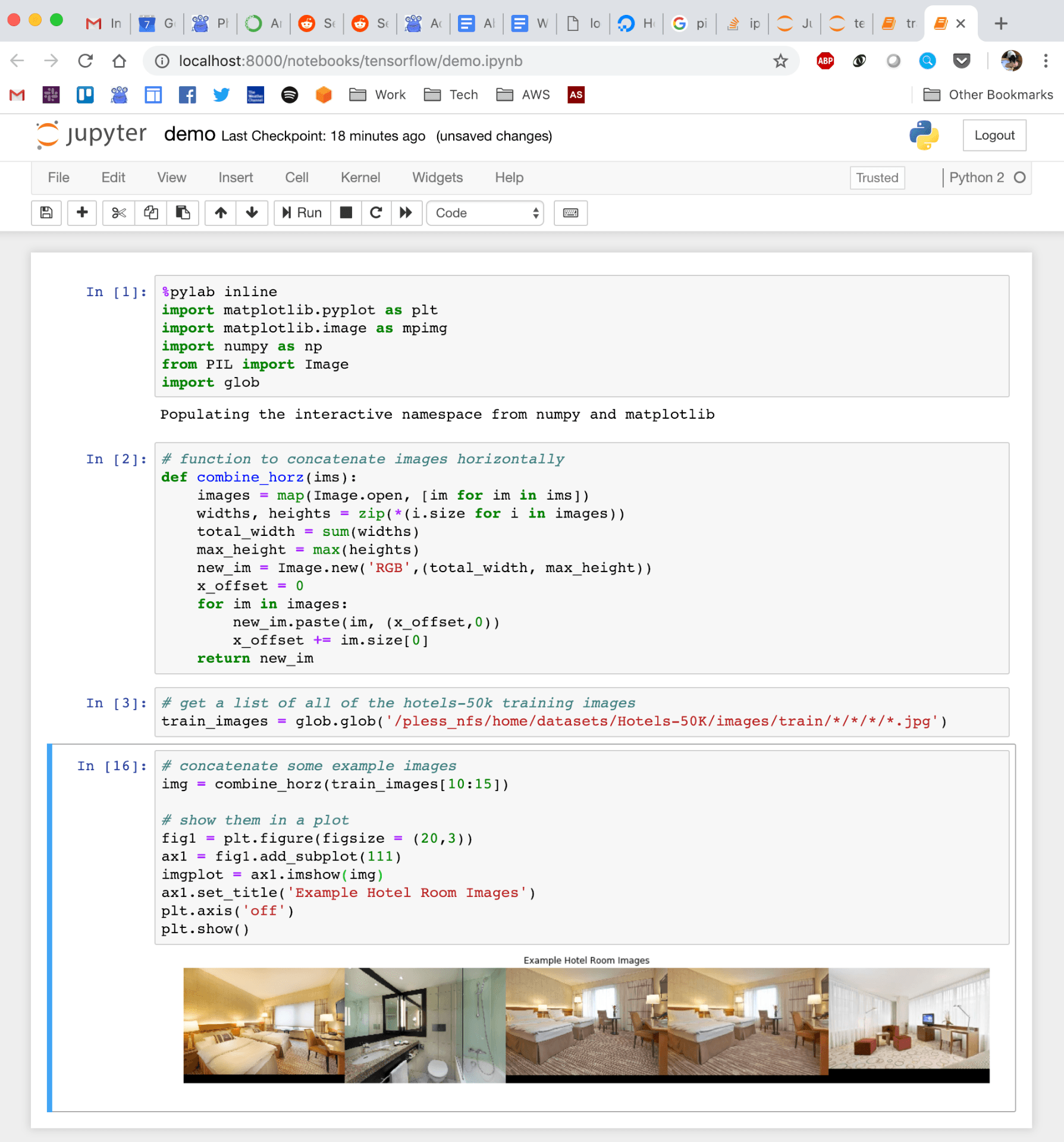
In terms of what I've been doing since I got back from DC: I've been working on implementing Hong's nearest neighbor loss in TensorFlow. I lost some time because of my own misunderstanding of the thresholding that I want to put into writing here for clarity.

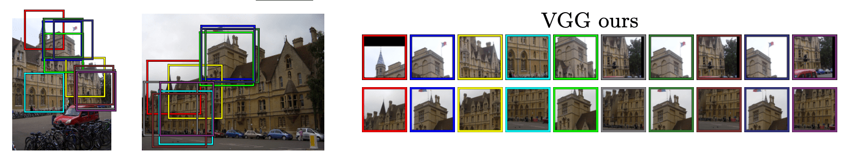
The "big" idea behind nearest neighbor loss is that we don't want to force all of the images in a class to project to the same place (in the hotels in particular, doing this is problematic! We're forcing the network to learn a representation that pushes bedrooms and bathrooms, or rooms from pre/post renovations to the same place!) So instead, we're going to say that we just want each image to be close to one of the other images in its class.

To actually implement this, we create batches with K classes, and N images per class (somewhere around 10 images). Then to calculate the loss, we find the pairwise distance between each feature vector in the batch. This is all the same as what I've been doing previously for batch hard triplet loss, where you average over every possible pair of positive and negative images in the batch, but now instead of doing that, for each image, we select the single most similar positive example, and the most similar negative example.

Hong then has an additional thresholding step that improves training convergence and test accuracy, and which is where I got confused in my implementation. On the negative side (images from different classes), we check to see if the negative examples are already far enough away from each other. If it is, we don't need to keep trying to push it away. So any negative examples below the threshold get ignored. That's easy enough.

On the positive side (images from the same class), I was implementing the typical triplet loss version of the threshold, which says: "if the positive examples are already close enough together, don't worry about continuing to push them together." But that's not the threshold Hong is implementing, and not the one that fits the model of "don't force everything from the same class together". What we actually want is the exact opposite of that: "if the positive examples are already far enough apart, don't waste time pushing them closer together."

I've now fixed this issue, but still have some sort of implementation bug -- as I train, everything is collapsing to a single point in high dimensional space. Debugging conv nets is fun!

I am curious if there's some combination of these thresholds that might be even better -- should we only be worrying about pushing together positive pairs that have similarity (dot products of L2-normalized feature vectors) between .5 and .8 for example?

Detecting Anomalous Data in TERRA

I had a meeting yesterday with Nadia, the project manager for TERRA @ the Danforth Plant Science Center, and she shared with me that one of her priorities going forward is to think about how we can do quality control on the extracted measurements that we're making from the captured data on the field. She also shared that the folks at NCSA have noticed some big swings in extracted measurements per plot from one day to the next -- on the estimated heights, for example, they'll occasionally see swings of 10-20 inches from one day to the next. I don't know much about plants, but apparently that's not normal. 🙂

Now, I don't know exactly why this is happening, but one explanation is that there is noise in the data collected on the field that our (and other's) extractors don't handle well. For example, we know that from one scan to the next, the RGB images may be very over or under exposed, which is difficult for our visual processing pipelines (e.g., canopy cover checking the ratio of dirt:plant pixels) to handle. In order to improve the robustness of our algorithms to these sorts of variations in collected data (and to evaluate if it actually is variations in captured data causing the wild swings in measurements), we need to actually see what those variations look like.

I proposed a possible simple notification pipeline that would notify us of anomalous data and hopefully help us see what data variations our current approaches are not robust to:

  1. Day 1, plot 1: Extract a measurement for a plot.
  2. Day 2, plot 1: Extract the same measurement, compare to the previous day.
    • If the measurement is more than X% different from the previous day, send a notification/create a log with (1) the difference in measurements, and (2) the images (laser scans? what other data?) from both days.

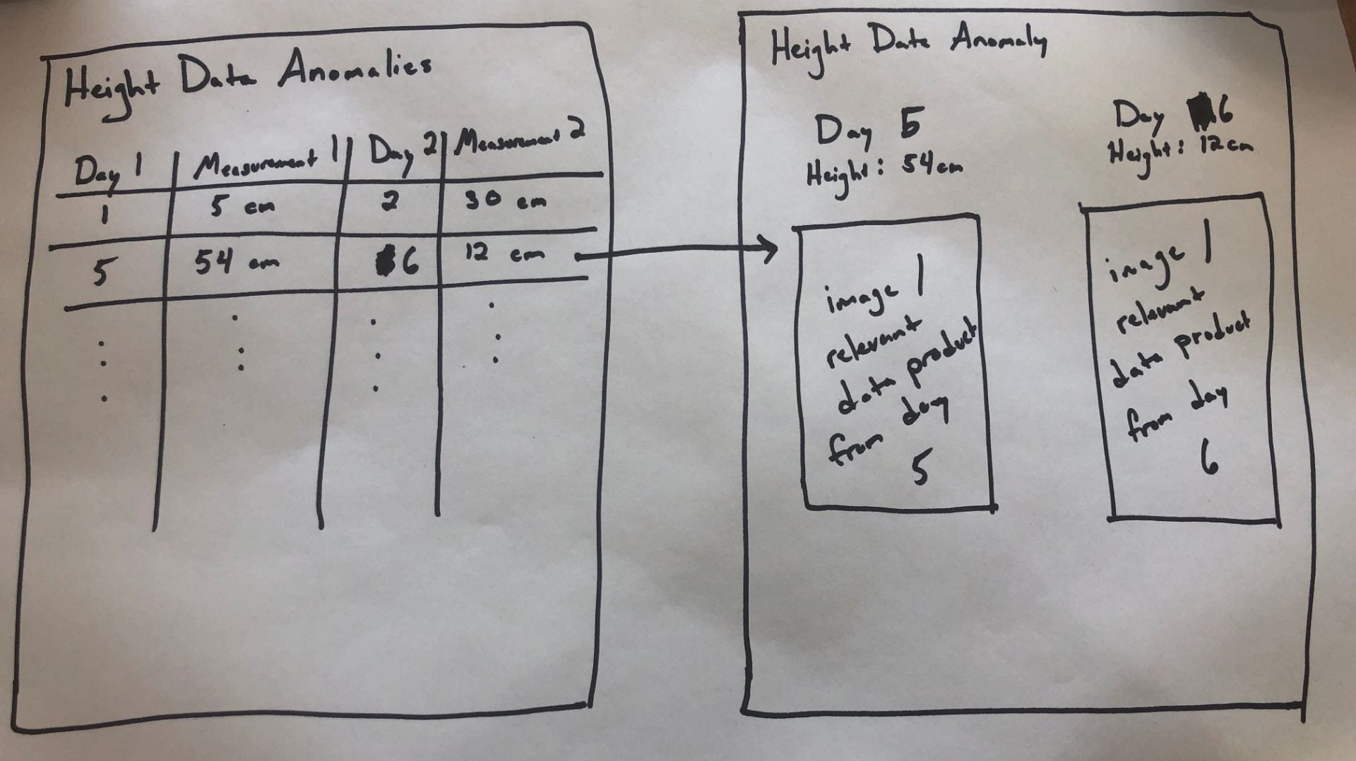
I'd like for us to prototype this on one of our extractors for a season (or part of a season), and would love input on what we think the right extractor to test is. Once we decide that, I'd love to see an interface that looks roughly like the following:

The first page would be a table per measurement type, where each row lists a pair of days whose measurements fall outside of the expected range (these should also include plot info, but I ran out of room in my drawing).

Clicking on one of those rows would then open a new page that would show on one side the info for the first day, and on the other the info for the second day, and then also the images or other relevant data product (maybe just the images to start with, since I'm not sure how we'd render the scans on a page like this....).

This would (1) let us see how often we're making measurements that have big, questionable swings, and (2) let us start figuring out how to adjust our algorithms to be less sensitive to the types of variations in the data that we observe (or make suggestions for how to improve the data capture).

[I guess this didn't end up being a particularly brief post.]
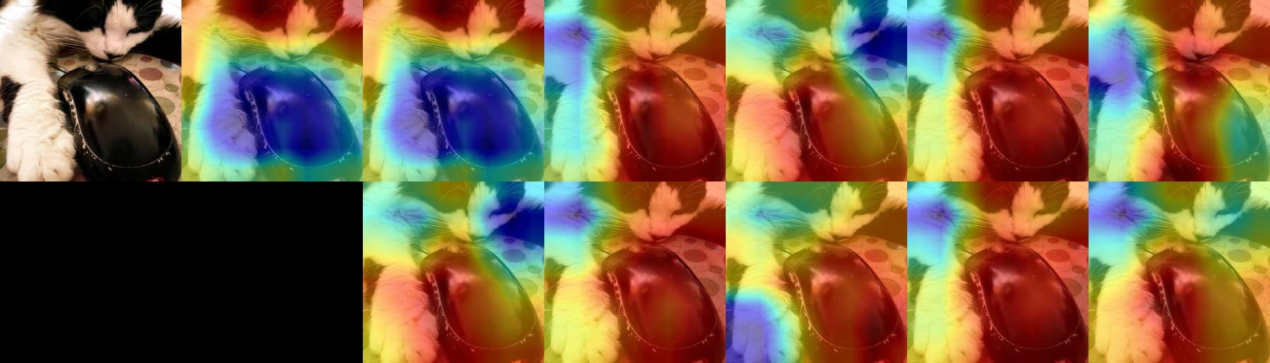
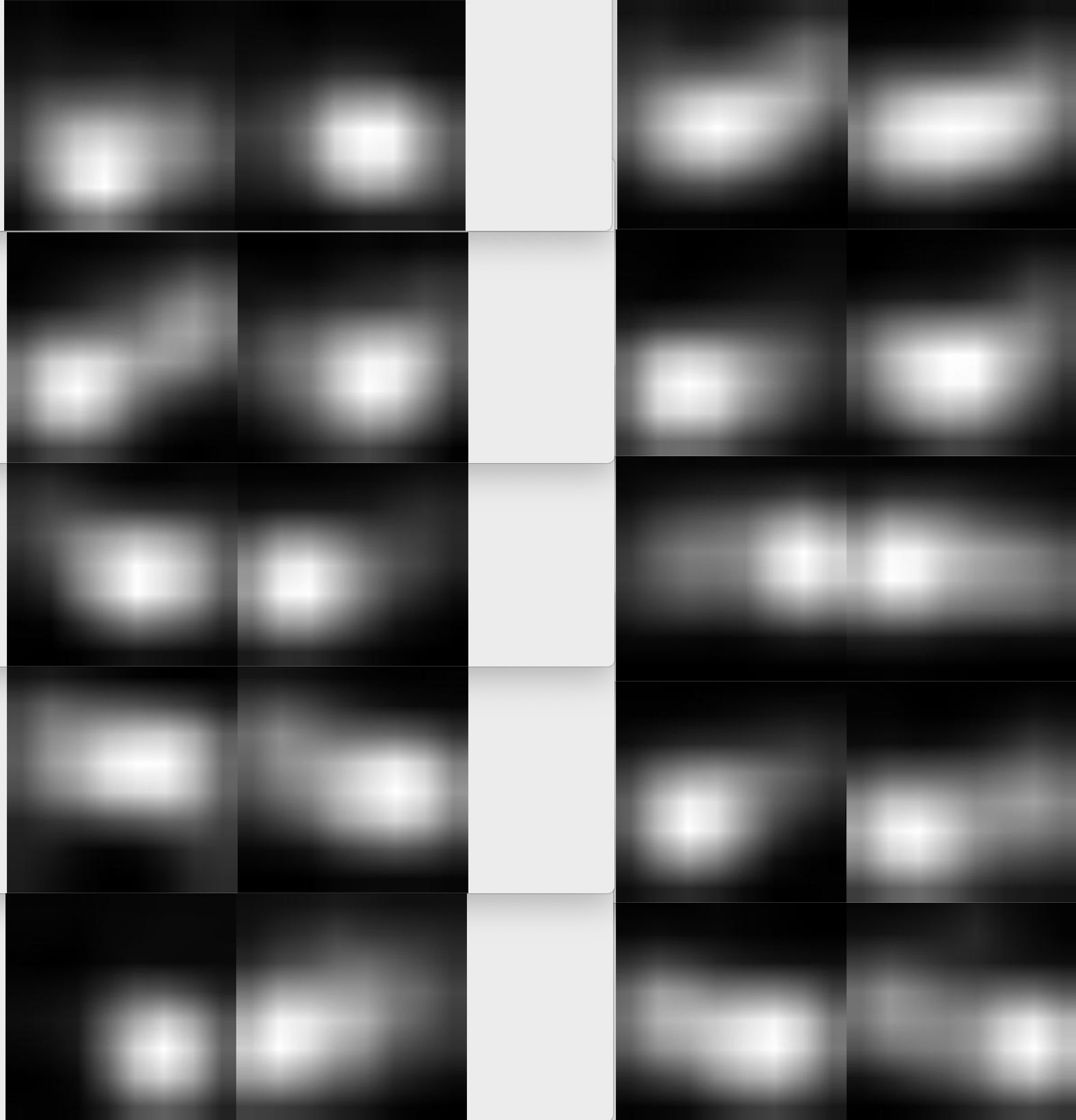
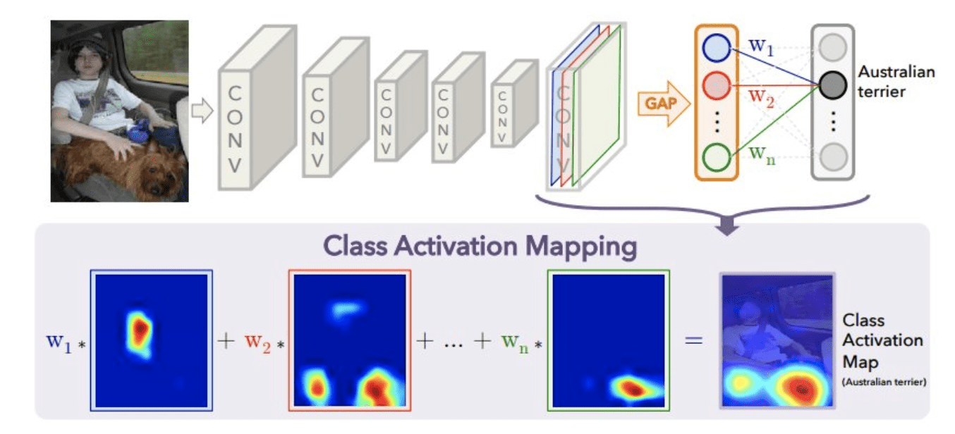
For the last few years, I been doing development by writing code, deploying it to the server, running stuff on the server without any GUI, and then downloading anything that I want to visualize. This has been a huge pain! We work with images and having that many steps between code debugging and visualizing things is stupidly inefficient, but sorting out a better way of doing things just hadn't boiled up to the top of my priority list. But I've been crazy jealous of the awesome things Hong has been able to do with jupyter notebooks that run on the server, but which he can operate through the browser on his local machine. So I asked him for a bit of help getting up and running so that I could work on lilou from my laptop and it turns out it's crazy easy to get up and running!

I figured I would detail the (short) set of steps in case other folk's would benefit from this -- although maybe all you cool kids already know about running iPython and think I'm nuts for having been working entirely without a GUI for the last few years... 🙂

On the server:

  1. Install anaconda:

    Anaconda Python/R Distribution

    Get the link for the appropriate anaconda version

    On the server run wget [link to the download]

    sh downloaded_file.sh

  2. Install jupyter notebook:

    pip install —user jupyter

    Note: I first had to run pip install —user ipython (there was a python version conflict that I had to resolve before I could install jupyter)

  3. Generate a jupyter notebook config file:jupyter notebook --generate-config
  4. In the python terminal, run:

    from notebook.auth import passwd

    passwd()

    This will prompt you to enter a password for the notebook, and then output the sha1 hashed version of the password. Copy this down somewhere.

  5. Edit the config file (~/.jupyter/jupyter_notebook_config.py):

    Paste the sha1 hashed password into line 276:

    c.NotebookApp.password = u'sha1:xxxxxxxxxxxxxx'

  6. Run “jupyter notebook” to start serving the notebook

Then to access this notebook locally:

  1. Open up the ssh tunnel:ssh -L 8000:localhost:8888 username@lilou.seas.gwu.edu
  2. In your local browser, go to localhost:8000
  3. Enter the password you created for your notebook on the server in step 4 above
  4. Create iPython notebooks and start running stuff!

Quick demo of what this looks like:

2

I was at the Danforth Plant Science Center all day yesterday as part of my on-boarding process. It was super fun -- lots of hearing stuff I didn't fully understand about plant biology, but also a lot of people excited to start thinking about imaging and image analysis in their work, plus the folks working on TERRA and TERRA adjacent stuff. Also gave a talk about vision for social good (finding a lost grave, using shadows to validate images on social media, TraffickCam) + visualization work. I was a bit worried it was light on anything having to do with plants at all, but folks seemed to love that. (A friend there specifically told me she was recruiting folks to attend by telling them it would be an hour without having to hear about plants.)

Today was spent putting together our poster for AAAI and working on getting the code finalized for release. The code repository is mostly ready to go but there's still a bit of work tomorrow to finish up on the re-producability section (re-producing our baseline results) and some of the evaluation code (all stuff that exists in the repo from the paper, just has to get cleaned up and moved over to the "published" repo).

You can see our AAAI poster below. This is not my best poster by any stretch. It's a small format (28" x 42") and I kind of think I tried to fit too much on there. Part of me wanted to just put the title and a ton of pictures of hotels and tell the story at the poster. But my goals with posters are always to (1) make it coherent even if someone doesn't want to talk to me at the poster (I'm never a fan of posters that aren't clear without either reading the paper or having a 20 minute conversation with the author), (2) make sure there is a storyline that is clear and compelling and (3) not necessarily repeat every bit of information or experiment from the paper. I think this poster still meets those goals but does not do it as well or as cleanly as previous posters that I've made. We made some effort to remove extraneous bits and add some white space but it still feels super busy. Time constraints ended up driving me to just get it printed, as I'm heading out of town tomorrow night, but I kind of wish I'd started working on this early enough to have a few more cycles on it.