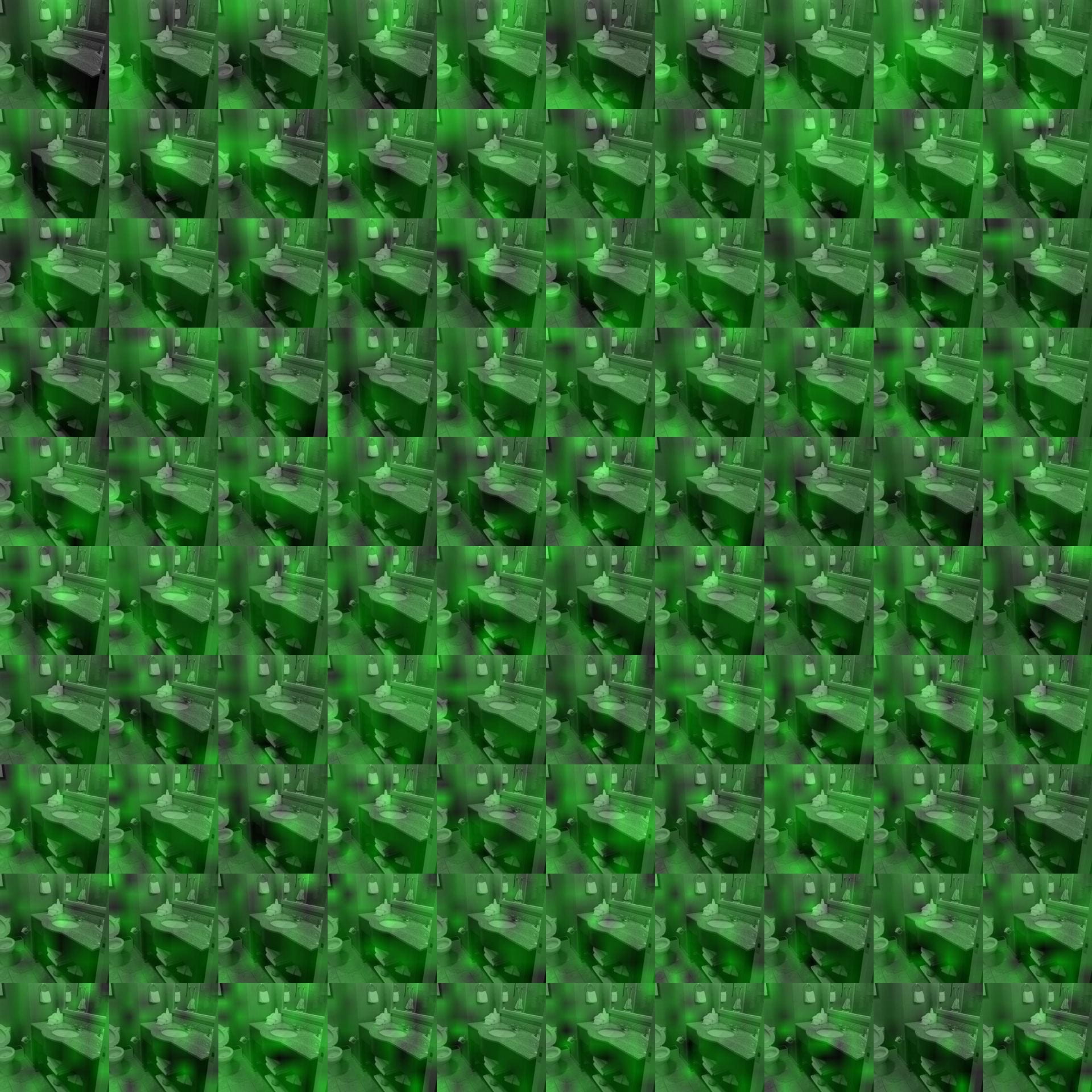
Given two images that are similar, run PCA on their concatenated last conv layer.
We can then visualize the top ways in which that data varied. In the below image, the top left image is the 1st component, and then in "reading" order the importance decreases (bottom right is the 100th component).
[no commentary for now because I ran out of time and suck.]