Continue the idea of triplets scatter. I plot the scatter after each training epoch for both training and testing set to visualize how the triplets move during the training. I put the animation in this slide.
These scatter plots is trained on resnet50 on Stanford Online products dataset.
https://docs.google.com/presentation/d/19l5ds8s0oBbbKWifIYZFWjIeGqeG4yw4CVnQ0A5Djnc/edit?usp=sharing
The difference of 1st order and 2nd order EPSHN is on the top right corner and the right boundary after 40 epochs training. There are more dots in that area for 1st order EPSHN rather than 2nd order EPSHN.
But this visualization still doesn't show the difference of how these two method affect on the triplets.
I pick a test image and its closest positive and closest negative after training and check the corresponding triplet. I draw its moving path during the training.
The blue dot is the origin imageNet similarity relation and the green dots the the final position of 1st order EPSHN and the red dot is the final position of 2nd order EPSHN.
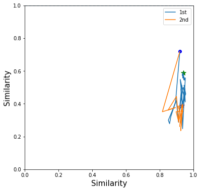
I find 2nd EPSHN move the triplet dot closer to the ideal position, (1,0), after several testing image checks.
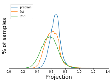
Then I try to do the statistics of the final dot distance to the point(1,0) with both method. I also draw the histogram of the triplets with imageNet initialization(pretrain).The following plot show the result.
Awesome plots! It would help if you:
(a) shared with everything that this animates if you click on it, and
(b) so we remember in the future; can you put the main details? (e.g. resnet50, initialized on imagenet, trained on stanford online products)
Yes, I will modified this post and add more detail later. I just check the whether I can show the animation together in this blog.