Our previous approach to visualizing similarity in embedding networks highlighted which parts of one image made it look like another image, but there was no notion of which parts of the two images corresponded to each other and contributed to the similarity.
One prior work that addressed this ("CNN Image Retrieval Learns from BoW") visualized components that contributed the most to the similarity but sorting the max pooling feature by contribution to the dot product, and then drawing same-color bounding boxes around the most highly activated regions for that filter:
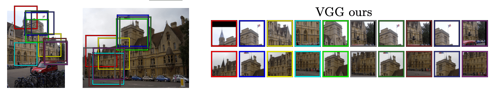 We can see, however, that many of those features are overlapping -- the network has filters that represent the same parts of the object in different ways. So what could you do instead?
Take the most similar images, run PCA on their (combined) 8x8x2048 final conv maps, represent those conv maps with a few features that capture the most important ways in which the representation varies instead of all 2048, and make a false color image where the same color in each image corresponds to the highly activated regions from the pca projected "filters".
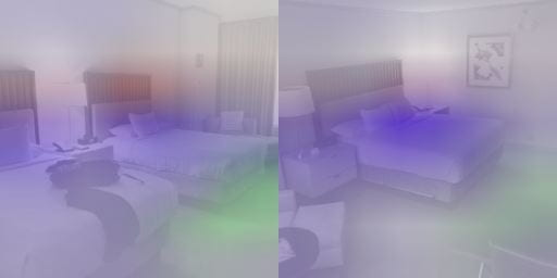
Still working out some opacity issues, but the first pass at some of these are kind of neat!
Two examples that are from the correct class:

Two examples from different classes:

