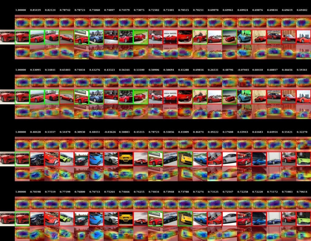
I spent much of this week creating visualizations to try to help us understand what Hong's easy positive approach is focusing on, compared to NPairs:
 These visualizations have maybe gotten a bit out of control. Each of the four sets of images shows a query image on the left, and then the 20 most similar images for a given embedding. Above the result image is the visualization of what made the query image look like that result, and below is what made the result image look like the query. Parts that are blue contributed to the similarity, and parts that are red detract from the similarity. I additionally show the actual similarity score for the pair of images above the column.
The first set of images are using our EPSHN embedding, and the results are sorted by similarity using EPSHN results. The second set of images are using NPairs as the embedding, but sorting by the similarity of EPSHN results. Then below that we the EPSHN and NPairs visualizations, but sorted by NPairs similarity scores.
This allows us to see both what the networks are focusing on, and also the difference in what each network considers to be the most similar images.
The above example (from the validation set of the cars dataset) is neat, in that we can see that NPairs most similar images are not as visually consistent as our EPSHN results -- this is consistent with the fact that NPairs embedding has to project all of the images from a class to a point, regardless of their visual consistency, whereas our approach only has to learn to project the most similar images to a point, allowing visually dissimilar members of a class to separate.
While the similarity visualizations are neat, and we can occasionally find differences in what the different approaches are focusing on, as in this case where the EPSHN result focuses on the headlight, while the NPairs approach focuses more on the wheelwell:
the visualizations have not yet yielded any actual consistent insight into systematic differences in what the networks are focusing on.
The other thing that I have been working on is getting back to thinking about objects, and whether different embeddings are more object-centric than others (for example, does EPSHN better represent "objects" in hotels because it doesn't have to have a representation that maps 'bedrooms' to 'bathrooms'?). I haven't made a ton of progress on this front, but I did make some visualizations of the images that are most activated in the hotels for a particular feature, trying to delve into whether it seems like individual filters in the last convolutional layer of our network seem to correspond to particular objects. Some of these are neat, such as this example that seems to show a filter that represents "pillows" and also "lamps":
And this one that seems to encode "patterned carpet":
They're not all so clear: http://zippy.seas.gwu.edu/~astylianou/images/similarity-visualization/HOTEL/filter_responses/
I don't have much more on this front at the moment, as I just started playing with this this morning. I also am not actually entirely sure where I'm going with this, so I don't even have a good "here's what I hope to have worked out by next week" paragraph to put in here, but this is the general topic I'm going to be focused on for a while.
 EPSHN
EPSHN NPairs
