Skip to content

Glitter pieces which are measured off, predicted on, and the prediction follows what we would actually expect

There are quite a few pieces of glitter which are measured to have an intensity of 0 (or < 0.1 normalized) in the test image, but then predicted to have an intensity        > 0.6 normalized. If we look at the intersection of the scan lines which correspond to the intensity plots of this centroid, we see that they intersect right around where the light was displayed on the monitor for the test image. So we would expect to see this centroid in our test image.


Below, I have shown the centroid on the image (pink dot), and we can verify that we don't see a glitter piece lit there, nor are there any lit pieces nearby. If there was another lit piece close to this centroid, we may believe that we just matched the centroid found in the test image to the wrong centroid from our glitter characterization. This does not seem to be the case though, so it's a bit of a mystery.

UPDATE: we have ideas 🙂

  1. threshold intensities the same way I did in my gaussian optimization (finding receptive fields) in the camera calibration error function
  2. throw out gaussians that are "bad"..."bad" can mean low eigenvalue ratio or intensity plots not well-matched

Aperture vs. Exposure

I played around with the aperture of the camera, and took many pictures with varying aperture - as the f-number decreases (aperture becomes larger), we see that a lot more light is being let in. As this happens, it seems that the center of a glitter piece slowly shifts, probably because if the exposure remains the same for all aperture settings, some images will have saturated pixels. The image below shoes multiple apertures (f/1.8, f/2, f/2.2,  ..., f/9), where the exposure was kept the same in all of the images. We can see that in some of the smaller f-number images, there seem to be some saturated pixels.


After realizing that the exposure needed to be different as the aperture varies, I re-took the pictures with f-number f/1.8, f/4 and f/8, and varied the shutter speed and it looks like the shift happens less if image taken with some exposure and low f-number look similar in brightness to an image taken with some exposure and a higher f-number.


Next Steps

  1. fix the intensity plots in the camera calibration and re-run
  2. try throwing out weird-gaussian centroids and re-run calibration
  3. take iphone pictures with the XR, figure out which exposure works best with its aperture (f/1.8) so that we get images that look similar to our camera images (f/8, 1 second exposure)

Goal: I am working on accurately calibrating a camera using a single image of glitter.

Paper Title: SparkleCalibration: Glitter Imaging Model for Single-Image Calibration ... maybe

Venue: CVPR 2020

For the last week, I have been specifically working on getting the calibration pipeline and error function up and running using the receptive fields of the glitter. Now, in the error function, I am predicting the intensity of each piece of glitter, and comparing this predicted intensity to the actual intensity (measured from the image we capture from the camera). I am also using a single receptive field for all of the glitter pieces instead of different receptive fields for each glitter piece, because we found that there were enough 'bad' receptive fields to throw off the normalization of the predicted intensities in the optimization.


This plot shows the predicted vs. measured intensities of all of the glitter pieces we "see" in our image (many have very low intensities since most glitter pieces we "see" are not actually lit. Here we see that there is a slightly noticeable trend along the diagonal as we expect to see. The red points are the glitter pieces which are incorrectly predicted to be off, the green points are the glitter pieces which are correctly predicted to be on, the black points are the glitter pieces which are incorrectly predicted to be on, and the rest are all of the other glitter pieces.

I also tried using the old on/off method for the error function (distance from the light location as the error function) and found that the results were quite a bit worse than the receptive field method (yay!)

Goal: My next tasks are the following:

  • search for the right gaussian to use for all the glitter pieces as the receptive field
  • run the checkerboard calibration for my currently physical setup
  • re-take all images in base and shifted orientations, re-measure the physical setup, take 'white-square' test images in this setup, and maybe some iphone pictures


(1) The one sentence scientific/engineering goal of your project

The current goal is to train a classifier to classify the "Awned/Awnless" classes.

(2) Your target end-goal as you know it (e.g. paper title, possible venue).

The further goal we imagine is to predict the "Heading Percentage", then train a model to find the "Wheat Spikes", the seed part of the wheat, to prove we can do it from UAV data.

(3) Your favorite picture you’ve created relative to your project since you last posted on the blog.

In the dataset, there is only one plot have the phenotype value "Mix", which means in this plot, the wheat have both awned and awnless phenotype. (It seems interesting, but we decided to remove them form the dataset first.)

(4) Your specific plan for the next week.

We imagine to finishing training the simple classifier this week, and see if we need to do more improvement work on it, or we can move on to the next step.

Per the Slack post yesterday, here is a quick rundown of the current state of the holographic glitter project.

(1) The one sentence scientific/engineering goal of your project

The goal is to be able to use a sheet of holographic glitter to be able to calibrate the position of a camera and a light source in 3D space.

(2) Your target end-goal as you know it (e.g. paper title, possible venue).

We imagine that the eventual paper will be titled something along the lines of "Single-Image Camera Calibration Using Holographic Glitter as a Reference". We're not sure about a possible venue for submission of this paper, since we're a little unfamiliar with the possibilities and the timeframes of when these things happen.

(3) Your favorite picture you’ve created relative to your project since you last posted on the blog.

We haven't created any genuinely new pictures in quite awhile, but we have taken new pictures of a new glitter sheet, which is exciting. We cannot currently include one in this blog post due to Dropbox woes.

(4) Your specific plan for the next week.

Our plan is to use these new pictures to run our whole pipeline and find where the bugs in it lie. Hopefully, by solving these bugs we should get accurate and trustworthy measurements for our groove spacing and orientation of the glitter dots.

The car dataset I use contains 8131 images of 64 dimensions. These data have 98 classes which had been labeled form 0 to 97, there are about 60 to 80 images of each class. What I am trying to do is instead of using Euclidean Distance or Manifold Ranking to query only one image, use Manifold Ranking to query two different images but in the same class at same time, to improve the accuracy.

Example results of one node pair(Green border images means the image has the same class as the query nodes, red ones means not same class) :

Node pair [0, 1]:

Using Euclidean Distance query 2 nodes separately and their ensemble result:

Using Manifold Ranking query 2 nodes separately:

Manifold Ranking ensemble result and the result of using our Two-Node Query to query them at same time:


Node Pair [1003, 1004]:

Using Euclidean Distance query 2 nodes separately and their ensemble result:

Using Manifold Ranking query 2 nodes separately:

Manifold Ranking ensemble result and the result of using our Two-Node Query to query them at same time:


Node Pair [3500, 3501]:

Using Euclidean Distance query 2 nodes separately and their ensemble result:

Using Manifold Ranking query 2 nodes separately:

Manifold Ranking ensemble result and the result of using our Two-Node Query to query them at same time:


The improved algorithm is as follows:

1. Use faiss library and setting nlist=100nprobe=10, to get the 50 nearest neighbors of the two query nodes. The query nodes are different but in the same class.(faiss library use Cluster Pruning Algorithm, to split the dataset into 100 nlist(cluster), each cluster has a leader, choose 10(nprobe) nearest clusters of the query point and find the K nearest neighbors.)

2. To simplify the graph, just use the MST as the graph for Manifold Ranking. In other words, now we have two adjacency matrices of the two query node.

3. Create a Link Strength Matrix, which at first is a 0 matrix has the same shape as the Adjacency Matrix, and if the there is a node near the 1st query point has the same class as the other node near the 2nd query point, then give a beta value to create an edge between these two nodes in the Link Strength Matrix.

4. Splicing Matrices, for example, the Adjacency Matrix of the 1st query point at top left, the Link Strength Matrix at top right and the transposed matrix of it at bottom left, the Adjacency Matrix of the 2nd query point at bottom right.

5. Normalizing the new big matrix as the Manifold Ranking does. However, when computing the Affinity Matrix, use the Standard Deviation of the non-zero values of the two pre-Adjacency Matrices only, to make the curve converge at ensemble result when the beta value is large.

6. Giving the two query nodes both 1 signal strength and others 0 when initialization. Then get the Manifold Ranking of all nodes.

The following plot shows the mAP Score of different beta values for all node pairs in the dataset, which means 8131 images in 97 classes, over 330k node pairs. I give the top ranked node score 1 if it has the same class as the query nodes and score 0 if not, the n-th top ranked node score 1/n if it has the same class as the query node and score 0 if not. As we can see, as the beta value increase, the mAP Score got the maximum value when the beta value at 0.7-0.8, which is better than only use one query node and the ensemble result of two query nodes.


My next step is to find if I can do some improvement to the time complexity of the algorithm, and try to improve the algorithm.

The car dataset I use contains 8131 images of 64 dimensions, which means in shape [8131, 64]. These data have 98 classes which had been labeled form 0 to 97, there are about 60 to 80 images of each class.

The algorithm is as follows:

1. Use faiss library and setting nlist=100, nprobe=10, to get the 50 nearest neighbors of all nodes. (faiss library use Cluster Pruning Algorithm, to split the dataset into 100 nlist(cluster), each cluster has a leader, choose 10(nprobe) nearest clusters of the query point and find the K nearest neighbors.)

2. Get all node pairs that in the same class without duplicate. For 2 nodes in a node pair, use the longest edge of MST to build a connected graph for Manifold Ranking, separately, as the Adjacency Matrix. Leave the two Adjacency Matrix keeping Euclidean Distance without doing normalization.

3. Create a Pipe Matrix, which at first is a 0 matrix has the same shape as the Adjacency Matrix, and if the there is a node near the 1st query point has the same class as the other node near the 2nd query point, then give a beta value to the edge of these two nodes in the Pipe Matrix.

4. Splicing Matrices, for example, the Adjacency Matrix of the 1st query point at top left, the Pipe Matrix at top right and bottom left, the Adjacency Matrix of the 2nd query point at bottom right.

5. Normalizing the new matrix and doing the Manifold Ranking to get the label of the highest scored node as prediction. Particularly, give the two query points an initial signal weight 1, other nodes 0.

The following plot shows the accuracy of different beta value for images in class 0. As we can see, as the beta value increase, the accuracy got the maximum value when the beta value at 0.8, which is better than only use one query point.


My next step is doing this process to all image classes to see the results, and make another plot that shows that either two close query points or far query points perform better.

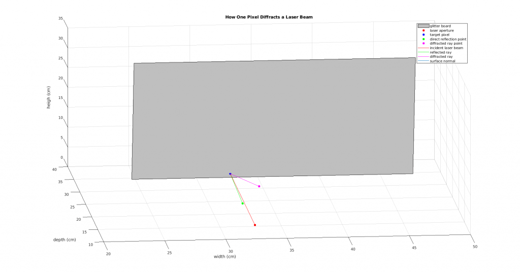
For the past few days, I've been analyzing the data we've collected to try to determine what a reasonable groove spacing of the pixels should be. This started with simply running our optimization function, whose results have been more confusing than helpful. In order to try to control for the wavelength of the light ray, Dr. Pless and I set up an experiment where we isolated a single pixel on the glitter sheet and shined at it a laser pointer whose wavelength was known to be 650nm. The setup looked like this:Although I was able to come up with a value for d (the groove spacing in nanometers) and psi (the angle of rotation of the grooves around a given axis), there were two issues with this experiment. The first is that it required me making really precise measurements by hand, so there could have been errors on my part in doing that. The second is that the value for d that I got, while it satisfied the equation we've been using, is very different from any d values returned from any of our optimizations. It ended up being about 350nm.

So, today I ran an experiment in which I went back to the original model of the darkroom. I selected only one pixel and found the incident light ray that produced the reddest color in the pixel. I then essentially pretended that the monitor was actually the laser pointer and assumed the light ray's wavelength was 650nm. Then, for two different instances of this, I modeled it and calculated the d and psi that would fulfill our equation. Here are the two models:

When I calculated the d and the psi for these two pixels, I got a d of between 1450 and 1550 for each of them, which makes me not trust how we're calculating these values anymore. I think that going forward, I need to find some better way to determine what d is so that it will remain constant throughout the entirety of the glitter board and in all my calculations.

This week, I use Manifold Ranking and Euclidean Distance to predict the label of certain nodes, and compared the results of these two methods.

The data is from Hong's work, it's a tensor in size 8131*64, which is an image data onto 64 dimensions. Also, I have the ground truth to every node, it is a dictionary that stores the labels for each node. The data structure is shown below.

...continue reading "Comparison of Manifold Ranking and Euclidean Distance in Real Data"

Utilizing the scripts outlined in previous blog posts by Grady and I, we were able to create an optimization function to solve for the groove distance and orientation of the diffraction gratings on our holographic glitter sheet. 

Using the data gathered from the plot, pictured above, we were able to get the angles needed for our diffraction grating formula

With the left half of the equation solved using the angles we got from our graph, and the wavelength solved using the method outlined in last week’s blog post about wavelengths, we were able to create an optimization function to solve for our missing information: the distance between the grooves and the orientation of the grooves.

However, there seems to be multiple combinations of orientations and groove distances that can produce the same angle combinations, therefore we need to use more information for our optimization function.

We decided to use all of the lines from a lit square on the monitor to one glitter board to see if acquiring more data to run our optimization on would provide more specific results.

However, there are still multiple combinations of distance and orientation for the grooves that result in near-zero values for the error value. To combat this, we are looking for more parameters for our optimization function that would add constraints to the answers we receive, such as a minimum or maximum value for the groove distance. We have begun working on a script that will look at all pixels and their angles to light squares on the monitor, rather than just one pixels’. Hopefully this large amount of data will produce more specific results from our optimization function.

Last week I recurrent the paper: Ranking on Data Manifold.

I created these 2-moon shape data randomly and added some noise on it. The left plot has 50 random 2-moon shape nodes,  while the right one has 100 (the following plots correspond to these two).

...continue reading "Recurring Ranking on Data Manifold and Refine with MST"