Skip to content

One of the fundamental challenges and requirements for the GCA project is to determine where water is especially when water is flooding into areas where it is not normally present.  To this end, I have been studying the flooding in Houston that resulted from hurricane Harvey in 2017.  One of the specific areas of interests (AOI) is centered around the Barker flood control station on Buffalo Bayou.

To get an understanding of the severity of the flooding in this area, this is what the Barker flood control station looked like on December 21, 2018...

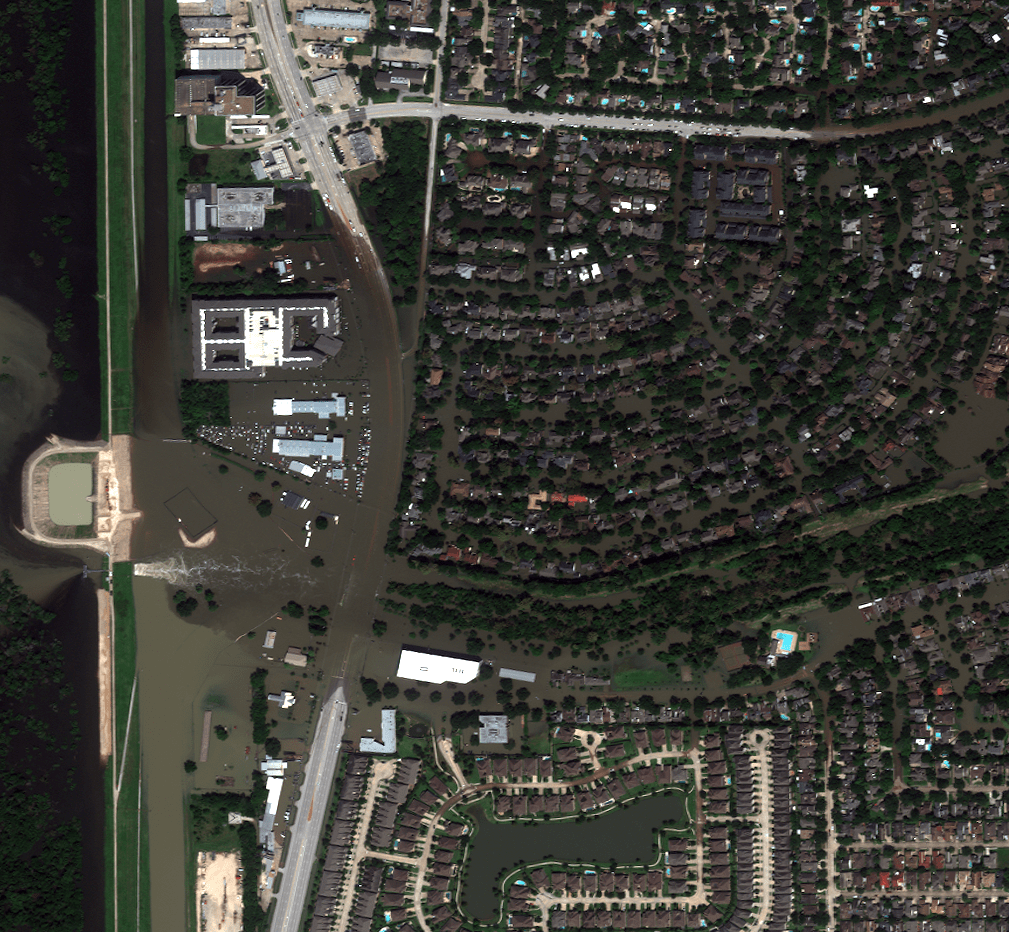
And this is what the Barker flood control station looked like on August 31, 2017...

Our project specifically explores how to determine where transportation infrastructure is rendered unusable by flooding.  Our first step in the process is to detect where the water is.  I have been able to generate a water mask by using the near infrared band available on the satellite that took these overhead photos.  This rather simple water detection algorithm produces a water mask that looks like this...

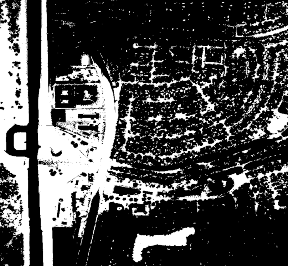
If the mask is overlayed onto the flooded August 31, 2017 image, it suggests that this water detection approach is sufficient for detecting deep water...

There are specific areas of shallow water that are not detected by the algorithm; however, parameter tuning increases the frequency of false positives.  There are other approaches that are available to us; however, our particular contribution to the project is not water detection per se and other contributors are working on this problem.  Our contribution is instead dependent on water detection, so this algorithm appears to be good enough for the time being.  We have already run into some issues with this simplified water detection, namely that trees obscure the sensor which causes water to not be detected in some areas.

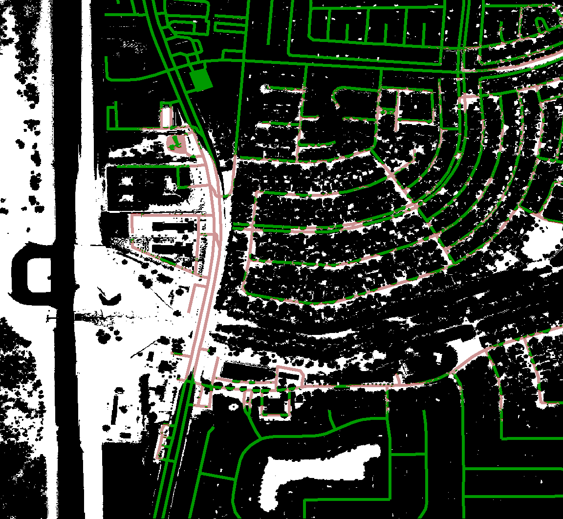
Besides water detection, our contribution also depends on road networks.  Again, this is not a chief contribution of our project and others are working on it; however, we require road information to meet our goals.  To this end, we used Open Street Maps (OSM) to pull the road information near the Barker Flood Control AOI and to generate a mask of the road network.

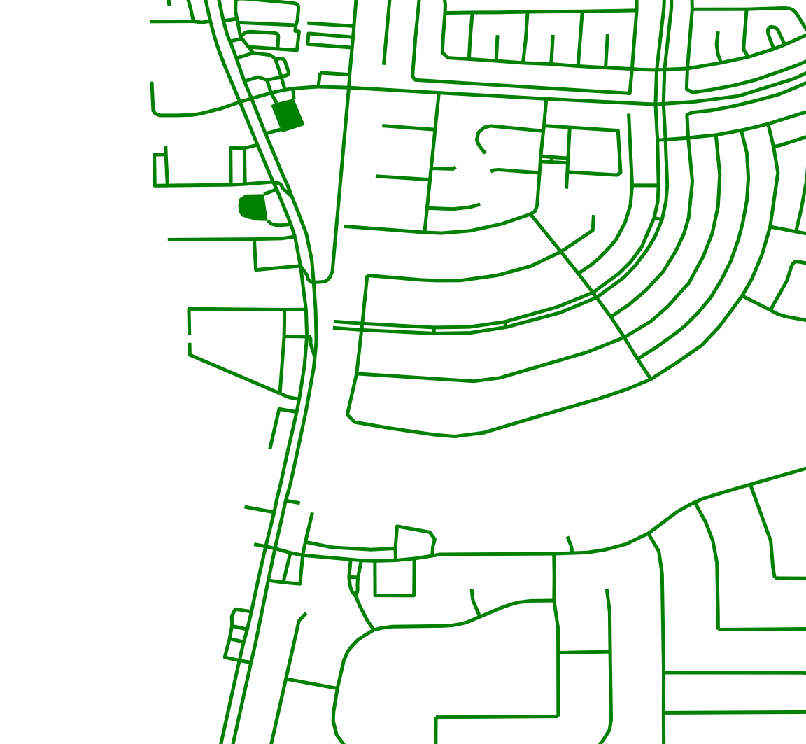
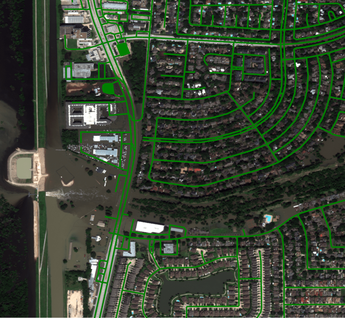
By overlaying the road network onto other imagery, we can start to see the extent of the flooding with respect to road access.

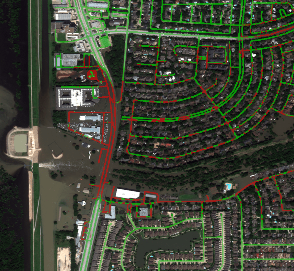
Our contribution looks specifically at road traversability in flooded areas, so by intersecting the water mask generated through a water detection algorithm with the road network, we can determine where water covers the road significantly and we can generate a mask for each of the passable and impassible roads.


The masks can be combined together and layered over other images of the area to provide a visualization of what roads are traversable.

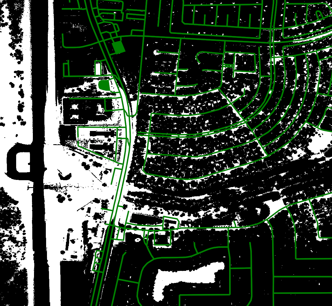
The big caveat to the above representations is that we are assuming that all roads are passable and we are disqualifying roads that are covered with water.  This means that the quality of our classification is heavily dependent on the quality of water detection.  You can see many areas that are indicated to be passable that should not be.  For example, the shaded box in the following image illustrates where this assumption breaks down...

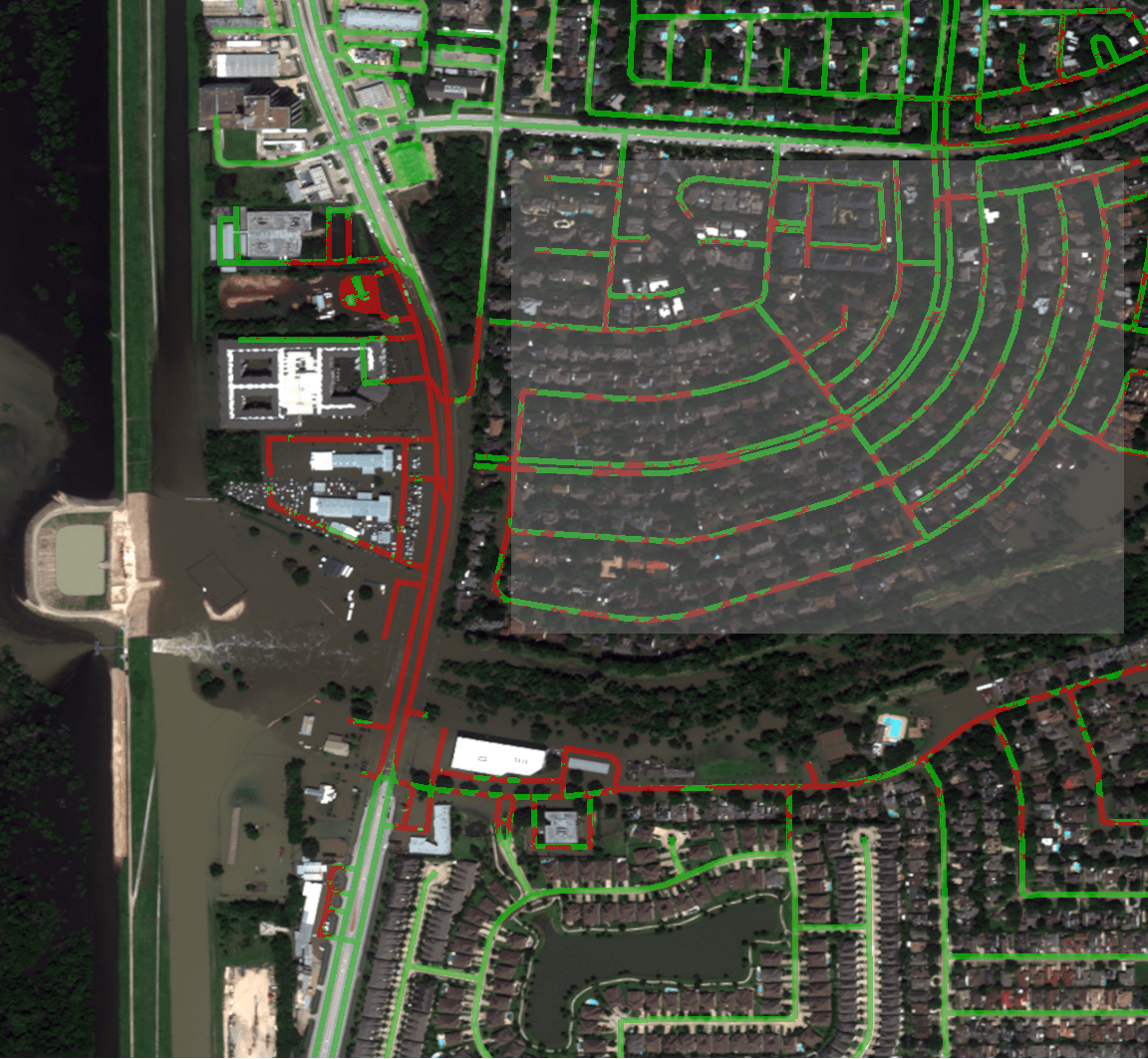
The highlighted neighborhood in the above example is almost entirely flooded; however, the tree cover in the neighborhood has masked much of the water where it would intersect the road network.  There is a lot of false negative information, i.e. water not detected and therefore not intersected, so these roads remain considered traversable while expert analysis of the overhead imagery suggests the opposite.

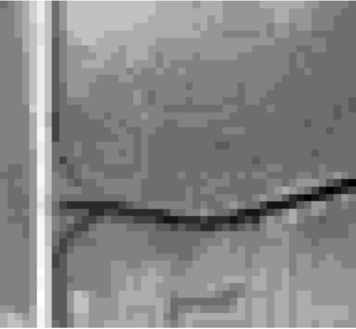
We are also combining our data with Digital Elevation Models (DEM) which are heightmaps of the area which can be derived from a number of different types of sensor.   Here is a heightmap from the larger AOI that we are studying derived from the Shuttle Radar Topography Missions (SRTM) conducted late in the NASA shuttle program.  This is a sample from the SRTM data of the larger AOI we are studying...

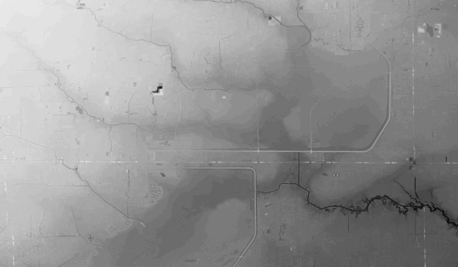
Unfortunately, the devil is in the details and the resolution of the heightmap within the small Barker Flood Control AOI is very bad...

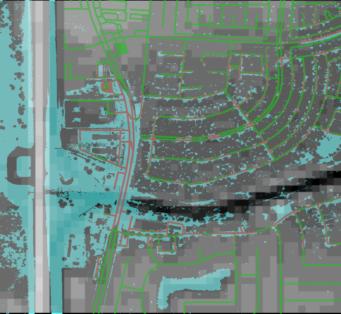
A composite of our data shows that the SRTM data omits certain key features, for example the bridge across Buffalo Bayou is non-existent and that our water detection is insufficient, the dark channel should show a continuous band of water due to the overflow.

The SRTM data is unusable for our next steps, so we are exploring DEM data from a variety of sources.  Our goal for the next few days is to assess more of the available and more current DEM data sources and to bring this information into the pipeline.


1

These are the plots of the final results of leaf length/width:

I looked up the hand measured result for 6/1/2017, The value of leaf length is around 600 (maybe mm).

But according to Abby's botanists folks, 600 mm at that stage is unreasonable. And the groth rate trands and values of this plot seems reasonable.

So next step is to upload these to the BETYDB.

This week, I applied for the accessibility to TERRA data. As long as I get permission, I will be able to train and visualize network for date classification.

I also cleaned up my code about ResNet18 and deep dream, learned the syntax of Pytorch and reviewed the rationale of some fundamental technics, such as dropout, batch normalization and various loss functions and optimization strategies. 


1

About Data Set: 

I have been working on classification of a Kaggle plant seedling dataset with 12 classes, here are some manually picked examples from each class  :

Black Grass:

Charlock:

Cleavers:

Common Chickweed:

Common Wheat:

Fat Hen:

Loose Silky Bent:

Maize:

Scentless Mayweed:

Shepherd's purse:

Small Flowered Cranesbill:

Sugar Beet:

A ResNet18 pre-trained on imageNet have been fine tuned on this data set, achieving about 99% prediction accuracy.

Deep dream x ResNet18:

This week, I used deep dream to visualize each layer of the network, here is some result I find interesting:

Original image and Maximizing 'add layer' following stage2, 3, 4:

Spiral (maize seedling) and grey vertical line (bar code?) are encoded in stage 2; Star-like shape (intersect of thin leaves) and green color are encoded in stage 3; Line, curves and angles are encoded in stage 4;

Comparing with the result of mixed4c layer in Inception V3:

No higher level structure about plants emerged in any layer no matter how I change the parameters. (Probably due to the monotony of the dataset, no high level structure is necessary to classify the dataset?)

Input, 2 conv layers, output of Stage2 unit2:


Input, 2 conv layers, output of Stage3 unit2:

The output becomes the ''weighted mixture'' of mainstream and shortcut. (Can this explain the high performance of ResNet?)

Class Activation Map:

I also tried the class activation map of some randomly picked data samples, most of the sample have expected Heat map like this:

Several pictures have rather unexpected activation map:

For the sample on the left, the flower-like leaves should be a very good indication of clever class, but the network only looks at cotyledons. For the samples on the right, the network ignore the leaves on the center.


Given two images that are similar, run PCA on their concatenated last conv layer.

We can then visualize the top ways in which that data varied. In the below image, the top left image is the 1st component, and then in "reading" order the importance decreases (bottom right is the 100th component).

[no commentary for now because I ran out of time and suck.]

Sometimes I like being a contrarian.  This paper (https://arxiv.org/pdf/1904.13132.pdf) suggests that you can train the low levels of a Deep Learning network with just one image (and a whole mess of data augmentation approaches, like cropping and rotating etc.).  This contradicts a huge amount of belief in the field that the reason to pre-train on Imagenet is that having a large number of images makes for a really good set of low level features.

I'm curious what other assumptions we can attack, and how?

One approach to data augmentation is to take your labelled data, and make *more* labelled data by flipping the images left and right and/or crop it and use the same label for the new image.  Why are these common data augmentation tools?  Because often flipping an image left right (reflecting it), or slight crops result in images that you'd expect to have the same label.

So let's flip that assumption around.  Imagine training an binary image classifier with many images that are labelled either (original or flipped).  Can a deep learning network learn to tell if something has been flipped left/right?  And if it does; what has it learned?  Here is an in-post test.  For these three images (the first three images that I see when I looked at facebook today), either the top or the bottom has been flipped from the original.  Can you say which is the original in each case?

[(Top, bottom, bottom)]

Answers available by highlighting above.

What cues are available to figure this out?  What did you use?  Could a network learn this?   Would it be interesting to make such a network and ask what features in the image it used to come to its conclusion?

What about the equivalent version that considers image crops?  (binary classifier: is this a cropped "normal picture" or not?  Non binary classifier: Is this cropped from the top left corner or the normal picture?  the top right corner?  the middle?)

What are other image transformations that we usually ignore?


2

Continue the idea of triplets scatter. I plot the scatter after each training epoch for both training and testing set to visualize how the triplets move during the training. I put the animation in this slide.

These scatter plots is trained on resnet50 on Stanford Online products dataset.

https://docs.google.com/presentation/d/19l5ds8s0oBbbKWifIYZFWjIeGqeG4yw4CVnQ0A5Djnc/edit?usp=sharing

The difference of 1st order and 2nd order EPSHN is on the top right corner and the right boundary after 40 epochs training. There are more dots in that area for 1st order EPSHN rather than 2nd order EPSHN.

But this visualization still doesn't show the difference of how these two method affect on the triplets.

I pick a test image and its closest positive and closest negative after training and check the corresponding triplet. I draw its moving path during the training.


The blue dot is the origin imageNet similarity relation and the green dots the the final position of 1st order EPSHN and the red dot is the final position of 2nd order EPSHN.

I find 2nd EPSHN move the triplet dot closer to the ideal position, (1,0), after several testing image checks.


Then I try to do the statistics of the final dot distance to the point(1,0) with both method. I also draw the histogram of the triplets with imageNet initialization(pretrain).The following plot show the result.

About the high similarity on conv1 with Abby's Mask, my thought is that the average pooling makes them same. I think for natural images, the value of pixels does share some distribution. For each single filter in the conv1, the results still share a same distribution. Then the global average of the output is around the excepted value of the distribution.

So I compared with different scale of downsampling of the output of conv1. The 16*16 result is using the upsampled mask. (The origin output dim of conv1 is 128*128*64)

From the above plots, after reducing the downsampling scale, the peak of the similarity goes lower and moves left.