Skip to content

I'm Oliver, a recent CS@GW '22 graduate, staying for a fifth year MS in CS. This summer I'm working with Addy Irankunda for Professor Pless on camera calibration with glitter! I will make weekly(ish) blog posts with brief updates on my work, beginning with this post summarizing my first week.

The appearance of glitter is highly sensitive to rotations. A slight move of a sheet of glitter results in totally different specs of glitter brightening (sparkling!). So if you already knew the surface normals of all the specs of glitter, an image of a sparkle pattern from a known light source could be used to orient (calibrate) a camera in 3D space. Thus we begin by accurately measuring the surface normals of the glitter specs by setting up a rig with camera, monitor for producing known light, and glitter sheet.

Let's get into it. Here's an image of glitter.

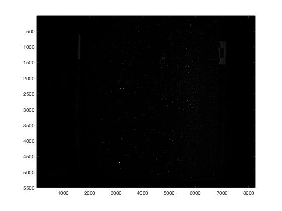
First, we need to find all the glitter specs from many such images (taken as a vertical bar sweeps across the monitor). We build a max-image where each pixel is the brightest among those across all the images. We then filter (narrow gaussian minus wide gaussian) which isolates just small bright points otherwise surrounded by darkness (like sparkling glitter specs). Finally, we apply a threshold to the filtered image. Here is the result at the end of that process.

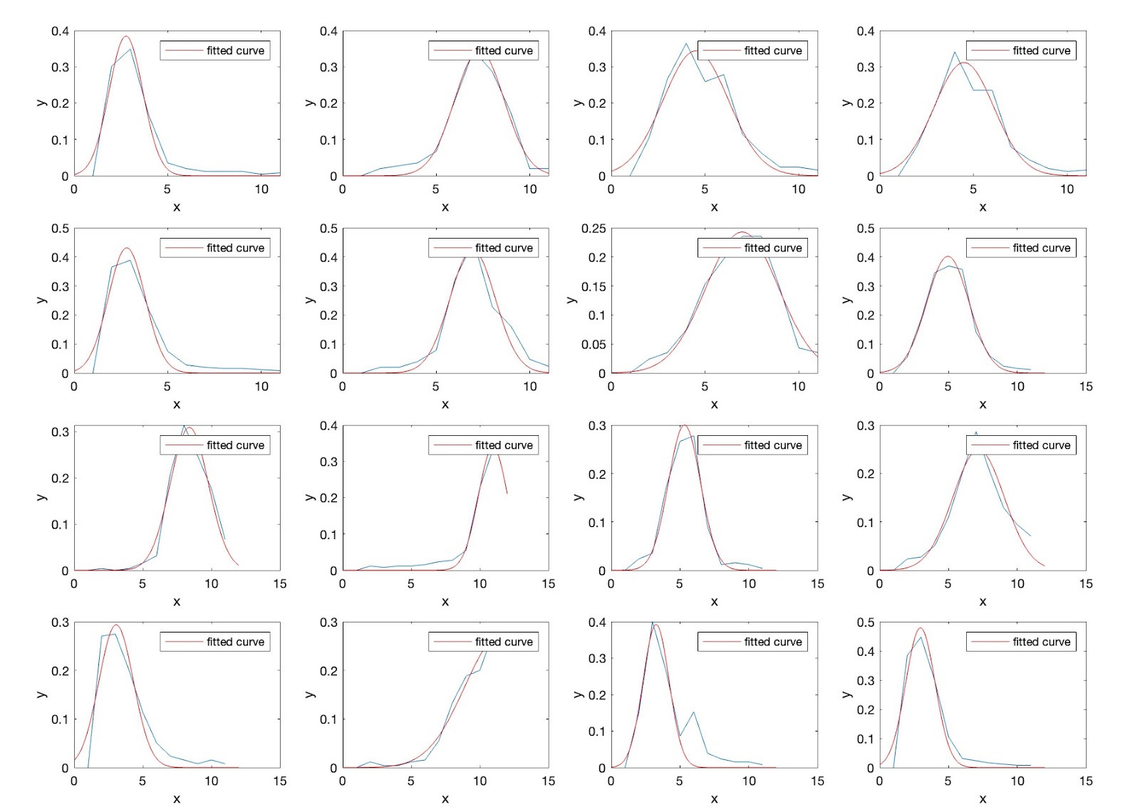
These little regions have centroids that we can take for now as the locations of the glitter specs. We expect that as the vertical bar (which itself is Gaussian horizontally) should produce Gaussian changes in brightness of the glitter specs as it moves across their perceptive field. Here are a bunch of centroids' brightnesses over the course of several lighting positions with fitted Gaussians.

So far these have been test images. To actually find the glitter specs' surface normals, we'll need to measure the relative locations of things pretty precisely. To that end, I spent some time rigging and measuring on the optical table a set up. It's early, and we need some other parts before this gets precise, but as a first take, here is how it looks.

The glitter sheet is on the left (with fiducial markers in its corners) and the monitor with camera peering over are on the right. Dark sheets enclose the rig when capturing. The camera and monitor are operated remotely using scripts Addy wrote.

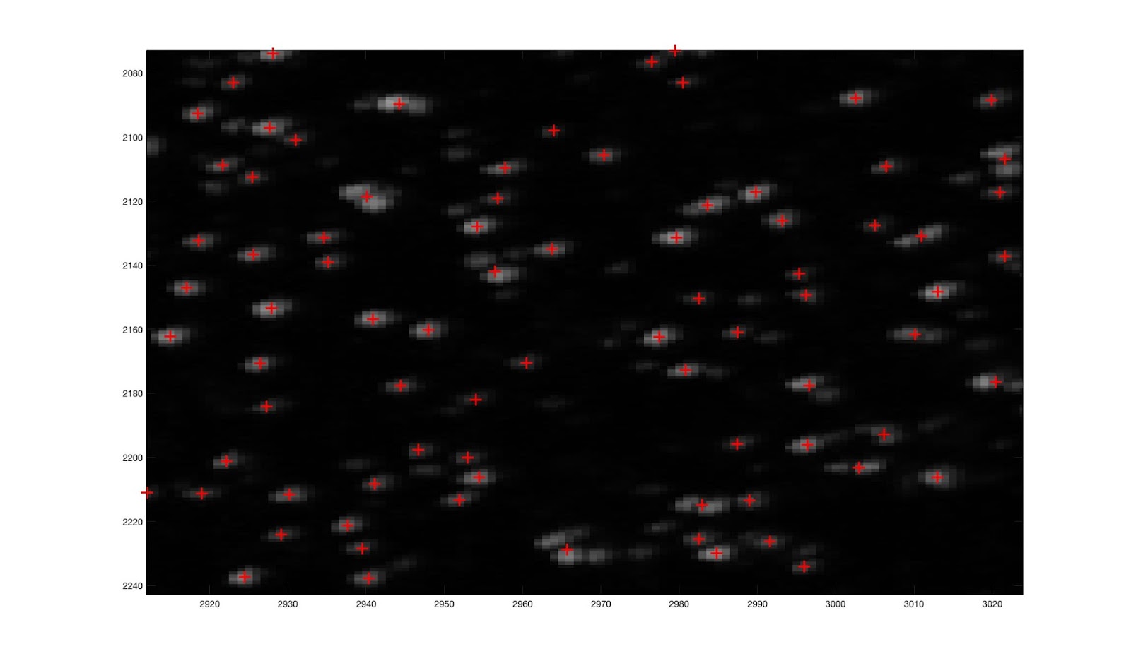
First attempts at full glitter characterization (finding the specs and their surface normals) is right around the corner now. One thing to sort out is that for larger numbers of images, simply taking the max of all the images leads to slightly overlapping bright spots. Here's an example of some brightnesses for random specs. Notice that number 7 has two spikes, strangely.

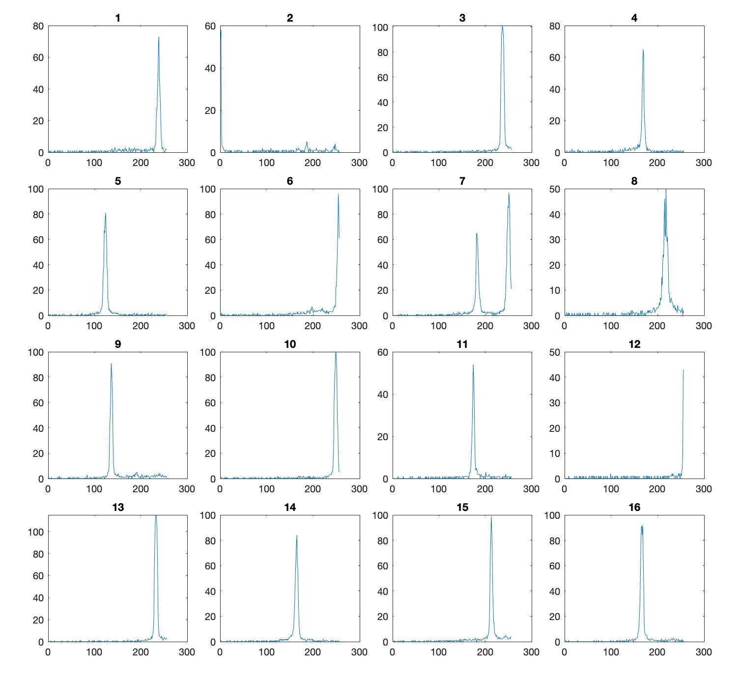
Sure enough, when you go to look at that spec's location, it is a centroid accidentally describing two specs.

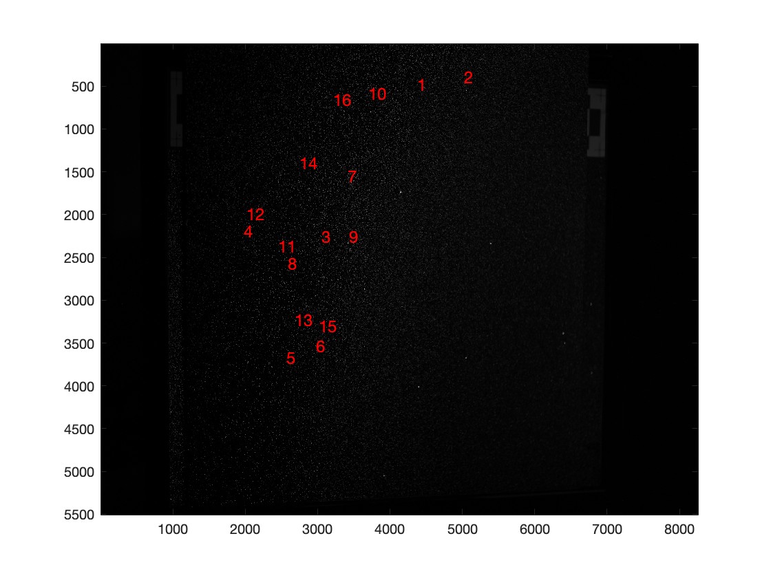
This image gives some sense of how big a problem this is... worth dealing with.

I am now pressing forward with improving this spec-detection and also with making the rig more consistent and measurable. Glitter characterization results coming soon...

This lab is trying an experiment --- a distributed approach of exploring following idea:

"Given many images of one scene, predicting the time an image was taken is very useful. Because you have to have learned a lot about the scene to do that well, the network must learn good representations to tell time, and those are likely to useful for a wide variety of other tasks"

So far we've made some progress (which you can partially follow in the #theworldisfullofclocks slack channel), with a start on framing the problem of: Given many images of a scene, how can you tell what time it is?

This google doc already lays out what are reasonable approaches to this problem. Here I want to share some visualizations that I want to make as we try to debug these approaches. These visualizations are of the data, and of the results of the data.

  • An annual summary montage, with rows organized as "day of the year" and columns organized as "time of day" (maybe subselecting days and times to make the montage feasible)
  • A daily summary montage with *all* the images from on day of a camera shown in a grid.
  • An "average day" video/gif that shows the average 7:00am image (averaged over all days of the year), and average 7:10a image... etc.

Kudos to everyone who has started to work on this; I think we have some good ideas of directions to go!

Hi everyone,

Here are a list of 20 fantastic! blogs about current machine learning research.

David Ahmadovhttps://blogs.gwu.edu/ahmedavid/
Farida Aliyevahttps://blogs.gwu.edu/ffaliyeva2022
Leyla Aliyevahttps://blogs.gwu.edu/leylaaliyeva
Ibrahim Alizadahttps://blogs.gwu.edu/ibrahim_alizada
Mustafa Aslanovhttps://blogs.gwu.edu/aslanovmustafa
Aydin Bagiyevhttps://blogs.gwu.edu/abagiyev
Aygul Bayramova https://blogs.gwu.edu/abayramova99/
Samir Dadash-zadahttps://blogs.gwu.edu/samirdadashzada
Habil Gadirlihttps://blogs.gwu.edu/hgadirli
Farid Jafarovhttps://blogs.gwu.edu/fjafarov
Narmin Jamalovahttps://blogs.gwu.edu/njamalova54
Steve Kaislerhttps://blogs.gwu.edu/skaisler/
Ilyas Karimovhttps://blogs.gwu.edu/ilyaskarimov
Kheybar Mammadnaghiyevhttps://blogs.gwu.edu/mammadnaghiyevk
Fidan Musazadehttps://blogs.gwu.edu/fmusazade
Natavanhttps://blogs.gwu.edu/ntakhundova/
Aykhan Nazimzadehttps://blogs.gwu.edu/anazimzada2020
Robert Plesshttps://blogs.gwu.edu/pless
Jalal Rasulzadehttps://blogs.gwu.edu/jrasulzade
Kamran Rzayevhttps://blogs.gwu.edu/kamran_rzayev
Ismayil Shahaliyevhttps://blogs.gwu.edu/shahaliyev

  1. There is a camera at the Tufandag Ski resort:

https://www.tufandag.com/en/skiing-riding/webcam/#webcam1

I think it shows video, and maybe there is a way to get a "live" still image from it. What can you do from many videos of this webcam? For example: can you predict the live weather parameters (wind speed or direction?) ? Can you highlight anomalous behaviors? Can you make a 3D model of that scene? For each of these problems, can you answer the Heilmeyer questions for this?

What could you do with many images from bird nest cameras?

There are YouTube streams of one box: https://www.youtube.com/watch?v=56wcz_Hl9RM and pages where you could write a program to save images over time: http://horgaszegyesulet.roszkenet.hu/node/1

2. Some live cameras give streams of audio and video:

(Many examples)

https://hdontap.com/index.php/video/stream/pa-farm-country-bald-eagle-live-cam

https://www.youtube.com/watch?v=2uabwdYMzV

Live Bar Scene

https://www.webcamtaxi.com/en/sound.html (tropical murphy's bar is good).

There is relatively little Deep Learning done that tries to think about one camera over very long time periods. Can you predict the sound from the video stream? Can you predict the video stream from the sound? Can you show the part of the image that is most correlated with the sound? Can you suppress the part of the sound that is unrelated to the video?

3. Some places give live video + text.

Twitch feeds have chat windows that are loosely aligned with the video. Live YouTube feeds also have a text chat.

https://www.youtube.com/watch?v=EEIk7gwjgIM

There is *lots* of work right now trying to merge the analysis of text and video, but very little that is done for one specific viewpoint or event. Can you build a system to:
(a) predict the chat comments that will come up from a video stream (given that you can train on *lots* of video from that specific video stream),

(b) Can you identify times in the video that will have more or less text?

(c) Can you show what part of the video is related to a text comment?

4. COVID image datasets

https://datascience.nih.gov/covid-19-open-access-resources

https://wiki.cancerimagingarchive.net/display/Public/COVID-19

I'm Robert Pless --- chair of the Computer Science Department at GWU, and I'd like to briefly introduce myself.

I was born in Baltimore, Maryland and have lived also in Columbus, Ohio, and Washington D.C. and Warsaw, Poland (although I was 4 at that time).

Within Computer Science, I work mostly on problems in Computer Vision (trying to automatically understand images), and Computational Geometry (building data structures for points and lines and shapes in space), and Machine Learning. A few of my favorite papers that I've written are here.

I'm especially interested in problem domains where new algorithms can help to improve social justice, healthier interactions with social media, and medical image understanding.

Outside of Computer Science, I have a four-and-a-half year old daughter who is learning to argue more and more effectively, and a grumpy dog. I'm interested in ultimate frisbee and modern art. My favorite artists are Dan Flavin and David Hockney, and I've written papers about the Art of Hajime Ouchi and Isia Leviant.

Glitter pieces which are measured off, predicted on, and the prediction follows what we would actually expect

There are quite a few pieces of glitter which are measured to have an intensity of 0 (or < 0.1 normalized) in the test image, but then predicted to have an intensity        > 0.6 normalized. If we look at the intersection of the scan lines which correspond to the intensity plots of this centroid, we see that they intersect right around where the light was displayed on the monitor for the test image. So we would expect to see this centroid in our test image.


Below, I have shown the centroid on the image (pink dot), and we can verify that we don't see a glitter piece lit there, nor are there any lit pieces nearby. If there was another lit piece close to this centroid, we may believe that we just matched the centroid found in the test image to the wrong centroid from our glitter characterization. This does not seem to be the case though, so it's a bit of a mystery.

UPDATE: we have ideas 🙂

  1. threshold intensities the same way I did in my gaussian optimization (finding receptive fields) in the camera calibration error function
  2. throw out gaussians that are "bad"..."bad" can mean low eigenvalue ratio or intensity plots not well-matched

Aperture vs. Exposure

I played around with the aperture of the camera, and took many pictures with varying aperture - as the f-number decreases (aperture becomes larger), we see that a lot more light is being let in. As this happens, it seems that the center of a glitter piece slowly shifts, probably because if the exposure remains the same for all aperture settings, some images will have saturated pixels. The image below shoes multiple apertures (f/1.8, f/2, f/2.2,  ..., f/9), where the exposure was kept the same in all of the images. We can see that in some of the smaller f-number images, there seem to be some saturated pixels.


After realizing that the exposure needed to be different as the aperture varies, I re-took the pictures with f-number f/1.8, f/4 and f/8, and varied the shutter speed and it looks like the shift happens less if image taken with some exposure and low f-number look similar in brightness to an image taken with some exposure and a higher f-number.


Next Steps

  1. fix the intensity plots in the camera calibration and re-run
  2. try throwing out weird-gaussian centroids and re-run calibration
  3. take iphone pictures with the XR, figure out which exposure works best with its aperture (f/1.8) so that we get images that look similar to our camera images (f/8, 1 second exposure)

Goal: I am working on accurately calibrating a camera using a single image of glitter.

Paper Title: SparkleCalibration: Glitter Imaging Model for Single-Image Calibration ... maybe

Venue: CVPR 2020

For the last week, I have been specifically working on getting the calibration pipeline and error function up and running using the receptive fields of the glitter. Now, in the error function, I am predicting the intensity of each piece of glitter, and comparing this predicted intensity to the actual intensity (measured from the image we capture from the camera). I am also using a single receptive field for all of the glitter pieces instead of different receptive fields for each glitter piece, because we found that there were enough 'bad' receptive fields to throw off the normalization of the predicted intensities in the optimization.


This plot shows the predicted vs. measured intensities of all of the glitter pieces we "see" in our image (many have very low intensities since most glitter pieces we "see" are not actually lit. Here we see that there is a slightly noticeable trend along the diagonal as we expect to see. The red points are the glitter pieces which are incorrectly predicted to be off, the green points are the glitter pieces which are correctly predicted to be on, the black points are the glitter pieces which are incorrectly predicted to be on, and the rest are all of the other glitter pieces.

I also tried using the old on/off method for the error function (distance from the light location as the error function) and found that the results were quite a bit worse than the receptive field method (yay!)

Goal: My next tasks are the following:

  • search for the right gaussian to use for all the glitter pieces as the receptive field
  • run the checkerboard calibration for my currently physical setup
  • re-take all images in base and shifted orientations, re-measure the physical setup, take 'white-square' test images in this setup, and maybe some iphone pictures


The goal is to have the website completely functional with an attractive, effective, efficient, and user friendly interface. The website should allow people such as CS PhD students and climate scientists to find needed data.

Currently, I have redone the "History" and "Dataset Info" pages, and have plans for the "About Us" page. Some other changes were made by the students during the group session that took place three weeks ago, including some work on the "Home" page. I have made further changes to the "Home" page. I have been looking through the camera images on the local server, and have selected certain images that I plan to use on some of the web pages.

My plan for the rest of this week and the next is to add the chosen images to the website, make additional changes, start the new "Publications" page, and hopefully finally get to see the updates on the website. I also would like the links to the "Cameras" pages to be functional. Then there is a list of other goals to be met.

(1) The one sentence scientific/engineering goal of your project

The current goal is to train a classifier to classify the "Awned/Awnless" classes.

(2) Your target end-goal as you know it (e.g. paper title, possible venue).

The further goal we imagine is to predict the "Heading Percentage", then train a model to find the "Wheat Spikes", the seed part of the wheat, to prove we can do it from UAV data.

(3) Your favorite picture you’ve created relative to your project since you last posted on the blog.

In the dataset, there is only one plot have the phenotype value "Mix", which means in this plot, the wheat have both awned and awnless phenotype. (It seems interesting, but we decided to remove them form the dataset first.)

(4) Your specific plan for the next week.

We imagine to finishing training the simple classifier this week, and see if we need to do more improvement work on it, or we can move on to the next step.

The car dataset I use contains 8131 images of 64 dimensions. These data have 98 classes which had been labeled form 0 to 97, there are about 60 to 80 images of each class. What I am trying to do is instead of using Euclidean Distance or Manifold Ranking to query only one image, use Manifold Ranking to query two different images but in the same class at same time, to improve the accuracy.

Example results of one node pair(Green border images means the image has the same class as the query nodes, red ones means not same class) :

Node pair [0, 1]:

Using Euclidean Distance query 2 nodes separately and their ensemble result:

Using Manifold Ranking query 2 nodes separately:

Manifold Ranking ensemble result and the result of using our Two-Node Query to query them at same time:


Node Pair [1003, 1004]:

Using Euclidean Distance query 2 nodes separately and their ensemble result:

Using Manifold Ranking query 2 nodes separately:

Manifold Ranking ensemble result and the result of using our Two-Node Query to query them at same time:


Node Pair [3500, 3501]:

Using Euclidean Distance query 2 nodes separately and their ensemble result:

Using Manifold Ranking query 2 nodes separately:

Manifold Ranking ensemble result and the result of using our Two-Node Query to query them at same time:


The improved algorithm is as follows:

1. Use faiss library and setting nlist=100nprobe=10, to get the 50 nearest neighbors of the two query nodes. The query nodes are different but in the same class.(faiss library use Cluster Pruning Algorithm, to split the dataset into 100 nlist(cluster), each cluster has a leader, choose 10(nprobe) nearest clusters of the query point and find the K nearest neighbors.)

2. To simplify the graph, just use the MST as the graph for Manifold Ranking. In other words, now we have two adjacency matrices of the two query node.

3. Create a Link Strength Matrix, which at first is a 0 matrix has the same shape as the Adjacency Matrix, and if the there is a node near the 1st query point has the same class as the other node near the 2nd query point, then give a beta value to create an edge between these two nodes in the Link Strength Matrix.

4. Splicing Matrices, for example, the Adjacency Matrix of the 1st query point at top left, the Link Strength Matrix at top right and the transposed matrix of it at bottom left, the Adjacency Matrix of the 2nd query point at bottom right.

5. Normalizing the new big matrix as the Manifold Ranking does. However, when computing the Affinity Matrix, use the Standard Deviation of the non-zero values of the two pre-Adjacency Matrices only, to make the curve converge at ensemble result when the beta value is large.

6. Giving the two query nodes both 1 signal strength and others 0 when initialization. Then get the Manifold Ranking of all nodes.

The following plot shows the mAP Score of different beta values for all node pairs in the dataset, which means 8131 images in 97 classes, over 330k node pairs. I give the top ranked node score 1 if it has the same class as the query nodes and score 0 if not, the n-th top ranked node score 1/n if it has the same class as the query node and score 0 if not. As we can see, as the beta value increase, the mAP Score got the maximum value when the beta value at 0.7-0.8, which is better than only use one query node and the ensemble result of two query nodes.


My next step is to find if I can do some improvement to the time complexity of the algorithm, and try to improve the algorithm.