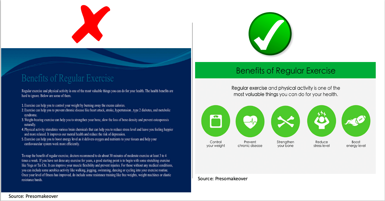
Before you go on, can you tell the difference(s) between both PowerPoint slides above?
As a grad student at GW, you will most likely get to do one or more presentations before you graduate whether in-class or virtual. There are many PowerPoint (PPT) mistakes common among students and professionals. These mistakes can cost a person some grades, jobs, clients or other opportunities.
1. Wordy PPT – A PPT should contain lesser words and more illustrations. It is called a presentation for this reason. Instead of copying and pasting paragraphs from a Word document into a PPT, you should try summarising them into simple sentences.
2. Slides without title – Every slide should have a title that passes information or summarises the slide. In the Home tab of your Microsft PowerPoint, click on Layout and select Title and Content. There may be some exceptions where a title is not applicable. In cases like that, the layout for the particular slide can be changed to “Blank”
3. Bland PPT – This refers to PPT without colors, just black and white theme. Attention span is reducing by the day, making a bland presentation makes it harder to capture the attention of your audience throughout your presentation. You can avoid this by selecting one of the Design themes in the Design tab of your Microsoft PowerPoint. However, be careful not to make it too colorful as this can be distracting.
4. No SmartArt/ Poor visuals – Good visuals aid understanding and retention. Instead of listing sentences, processes or sub-categories, you can make your presentation more visually appealing by converting them to SmartArt. You can achieve this by going to the Insert tab of your Microsoft PowerPoint and clicking on SmartArt. Alternatively, if you have already made a list in the textbox of your slide, select all, then click on the Home tab, next click on “Convert to SmartArt”
5. Too much transition effects and animations – This might be distracting. If you have to use transition effects, stick to the simple effects.
6. No slide number – Having slide numbers help your viewers to be able to easily refer to the slide when they have questions.
7. No design – Updated versions of Microsoft Powerpoint have a feature called “Design Ideas” under the Home tab. Design ideas give ten different beautiful design suggestions for each slide. It saves time and makes your presentation more visually appealing. Use design ideas!
Be First to Comment