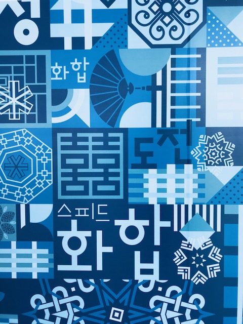
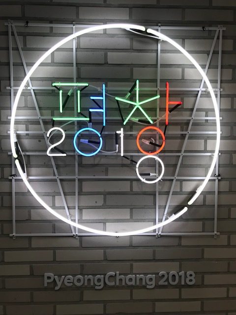
For the 2018 Games, the Koreans chose to incorporate one of their most valuable assets into every aspect of the Games’ design: Hangul (the Korean alphabet). Hangul is largely regarded as one of the best writing systems in the world because it is so logical and concise. One can see elements of Hangul in the logo for the Games as well as all the promotional banners. Throughout my adventures at the Games, whenever I saw a 2018 Olympic banner, it was a reminder this was Korea’s opportunity to share their culture with the world.

CASA Italia
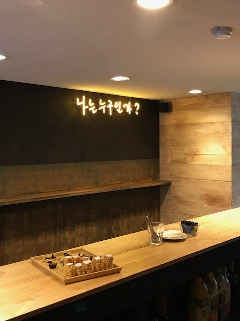
On a side note, several of the nation houses incorporated unique elements of the Korean host country into their design. However, Casa Italia probably did it the best. Throughout the house, one could see elements of the Korean language posted in neon signs, which provided guests an opportunity to reflect on their current location while enjoying Italian culture. One of my favorite signs is in the pic below: a neon yellow sign, written in Korean, hags on a wall inside the espresso bar inside Casa Italia. In English, the sign translates to 'who are you?' I personally thought this was really cool and clever. But, truth be told, I was too exhausted to really engage in any philosophical discussions of self.